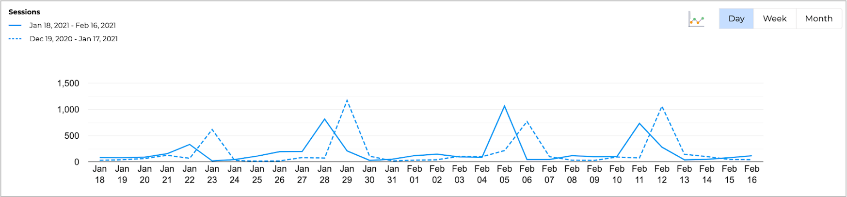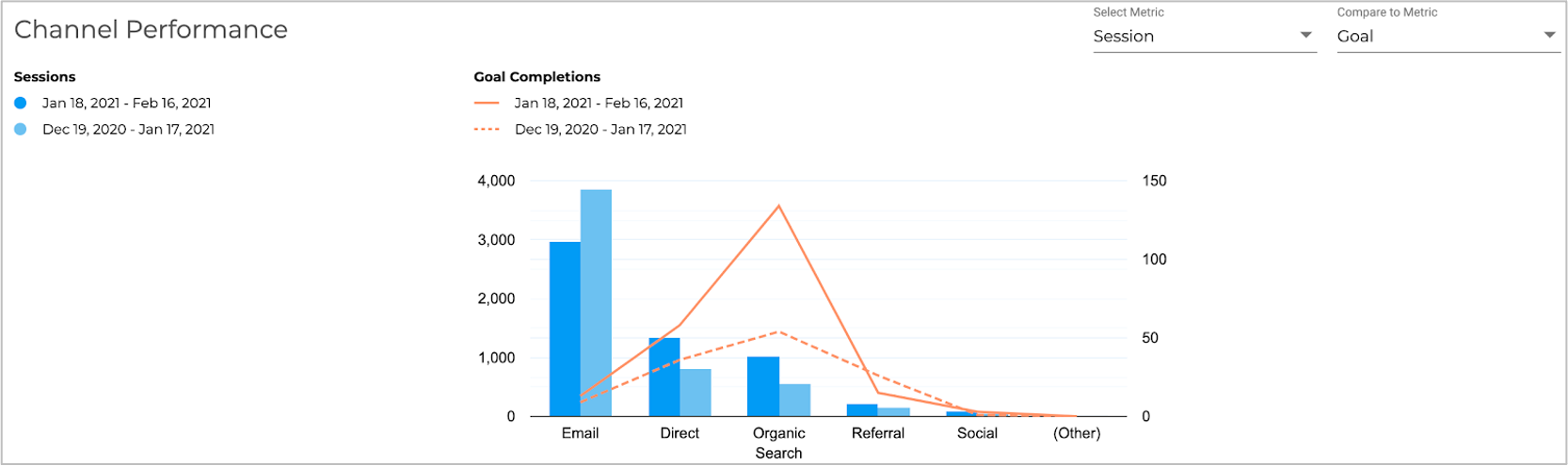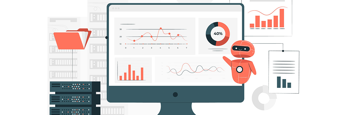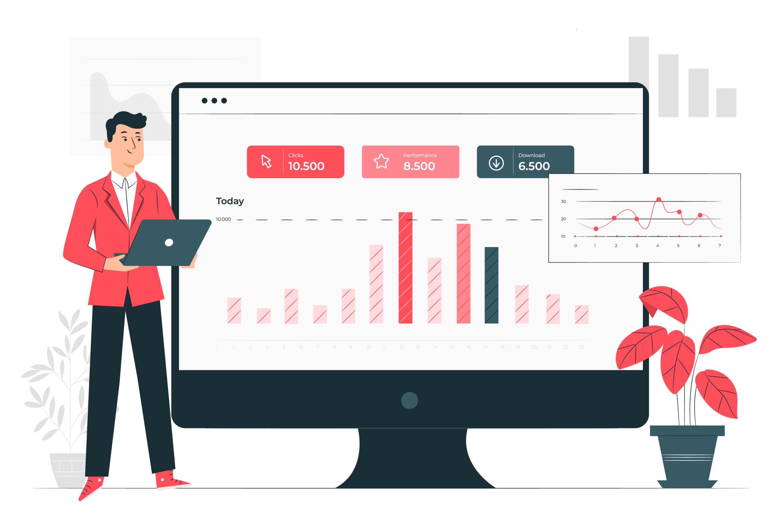
Open almost any marketing dashboard or marketing reports and you’ll see the same thing: a wall of charts showing clicks, impressions, conversions, and spend, trending up or down. What you won’t see, in most tools, is an explanation of why any of it happened. That gap, between showing data and explaining it, is exactly what automated performance insights are built to close, and it’s changing what agencies can reasonably promise their clients.
The Problem With Dashboard-Only Marketing Reports
A dashboard is a mirror: it reflects what happened, accurately and often beautifully, but it doesn’t tell you anything you didn’t already know how to look for. A client looking at a dip in conversions still has to ask, “why did this happen?”, and someone on the agency side still has to dig through the data to answer that question every single reporting cycle. Dashboards solve visualisation. They don’t solve interpretation.
What “Automated Insights” Actually Means
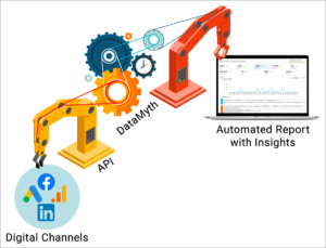
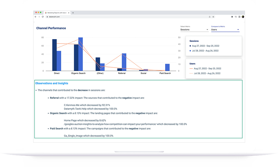
Automated performance insights take the same underlying data a dashboard shows and add a written, plain-language explanation of what changed and, where the data supports it, why. Instead of a chart showing conversions dropped 18% in the last two weeks, an insight-driven report states that conversions dropped 18%, largely concentrated in one campaign, coinciding with a drop in ad spend on that campaign. That’s the difference between a chart and an answer.
Why This Matters More for Agencies Than for In-House Teams
An in-house marketer lives inside their own data every day and can usually spot a trend without much explanation. An agency account manager might be reviewing a dozen or more clients’ accounts in the same week, across different industries and different baselines. Written insights do the first pass of interpretation automatically, so the account manager’s time goes toward judgment and client conversation, not toward re-deriving the same explanation from scratch for every account.
How This Changes the Client Conversation
- Clients read a plain-language explanation instead of asking the agency to interpret a chart on a call.
- Account managers spend review time checking the insight against their own knowledge of the account, rather than writing the insight from scratch.
- Reports become genuinely self-serve, a client can understand what happened without scheduling a meeting to have it explained.
Is Automated Insight-Writing Accurate Enough to Trust?
Automated insights are generated directly from the connected data, which makes them consistent and fast, but like any automated analysis, they work best as a strong first draft rather than a final, unreviewed verdict. The most effective workflow pairs automated insights with a quick human review before a report goes to a client, catching context the data alone can’t capture (a paused campaign, a seasonal event, a client-side change) while still eliminating the hours previously spent writing commentary from a blank page.
Conclusion
Dashboards were the last generation of marketing reporting. The next generation explains itself. As more agencies adopt automated performance insights, a report that only shows charts will start to look incomplete by comparison, clients will expect to be told what happened, not asked to figure it out themselves. Tools like DataMyth are built around that shift, generating the written explanation alongside the data rather than leaving it as homework for the account manager.
Frequently Asked Questions (FAQs)
What’s the difference between a marketing dashboard and an automated report with insights?
A dashboard visualises data, charts, graphs, and numbers. An automated report with insights goes a step further, adding a written explanation of what changed and why, so the reader doesn’t have to interpret the chart themselves.
Can AI actually explain why a campaign’s performance changed?
Automated insight tools analyse the connected data, spend, audience, timing, and related metrics, to identify likely contributing factors and describe them in plain language. It’s a data-driven first explanation, most effective when paired with a quick human review for context the data alone doesn’t capture.
Do clients prefer reports with written insights over raw data?
Agencies that have made the switch generally report fewer clarifying calls and emails after sending reports, since clients no longer need the agency to explain what a chart means before they can act on it.
Is automated insight-writing accurate, or does it still need human review?
Automated insights are generated directly from real performance data, which makes them reliable as a starting point. Most agencies still do a brief human review before sending a report to a client, to add context, like an external event or a client-side change, that the data alone wouldn’t show.