How to Use Google Search Console (Webmaster Tools) to Diagnose and Fix Indexing Issues for Client Sites

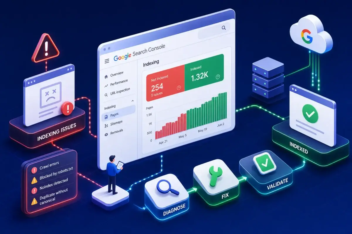
A client rings you on a Monday morning to say their service pages have vanished from Google search. Before you open anything else, you open Google Search Console, formerly known as Google Webmaster Tools. GSC is the most direct line of communication between a website and Google’s crawlers, and the URL Inspection tool’s “Test Live URL” function, along with the Page Indexing report, can quickly reveal whether the problem is a crawling block, an indexing error, or something else entirely. If you still see the old name “Webmaster Tools” in tutorials online, do not worry: it is the same product, simply rebranded by Google some years ago. The core functionality has only grown since then.

What follows covers the full agency workflow for using webmaster tools Google Search Console: setting up client properties correctly, submitting and monitoring sitemaps, interpreting the reports that actually move the needle, and confirming fixes before you tell a client the issue is resolved. At the end, we will look at how agencies can take raw GSC data and combine it with GA4 and Google Ads to produce reports that tell a complete story, not just a list of indexing statuses.

How to set up Google Search Console for agency and client properties

The setup step is where most agencies make a small but consequential decision: which property type to add. GSC offers two options. A Domain property covers every subdomain, protocol, and path under a root domain, so a single property captures http://, https://, www, and non-www versions simultaneously. A URL-prefix property covers only the exact URL you enter, which means a separate property is needed for each variation. For client sites, the Domain property is almost always the right choice. It requires DNS verification, a small overhead, but gives you complete, unfragmented data from day one.

For verification, the DNS TXT record is the most robust method because it does not depend on anything installed on the website itself. If the agency manages the client’s domain DNS, you can drop the record in and verify within minutes. If the client’s Google Tag Manager container is already published and live on the site, GTM verification is a fast alternative: add a URL-prefix property, choose the GTM option, confirm the container is published, and you are done. HTML file upload and HTML meta tag are both reliable but require server or CMS access, which not every agency arrangement includes.

Google Analytics verification works when the tracking code on the site belongs to the same Google account being used to verify, but this can get complicated when the client owns the Analytics property and the agency is using a separate account. Weigh up which method suits your access arrangement before starting.

Once the property is verified, managing access correctly protects both the client and the agency. The client should retain Owner-level access to their own property. Agency team members who need to submit sitemaps, request indexing, and investigate issues should be added as Full users through Settings > Users and permissions. Restricted user access is appropriate for team members who only need to pull reporting data. Each person gets added with their individual Google account, so no passwords change hands, and the client can remove access instantly if the relationship ends.

Submitting sitemaps in webmaster tools Google Search Console and what to watch afterwards

Submitting a sitemap is straightforward: navigate to Indexing > Sitemaps, paste the sitemap path (usually sitemap.xml or sitemap_index.xml), and click Submit. Before you do, confirm the sitemap URL is publicly accessible and that no robots.txt rule is blocking Googlebot from fetching it. Many popular CMS platforms and plugins generate sitemaps automatically, check your platform’s documentation to confirm the default sitemap path and ensure it is enabled before submitting.

Understanding sitemap report statuses

After submission, the Sitemaps report shows three statuses worth understanding. Success means Google fetched the file without errors. Couldn’t fetch means the sitemap URL returned an error or was blocked, which usually points to a hosting issue or a robots.txt conflict. Has errors means the file was retrieved but contains parsing problems or invalid URLs.

Beyond the fetch status, watch the submitted versus indexed URL count. A submitted count of 200 and an indexed count of 60 is not automatically a crisis, but a large gap warrants investigation. It often points to duplicate content, thin pages, or canonicalisation problems that are preventing Google from selecting those URLs as the preferred version to index. Consult the Page Indexing report alongside the Sitemaps report to identify which specific issues apply.

Setting realistic timing expectations

Timing is worth addressing with clients early. Google typically fetches a submitted sitemap within a few hours, though this can vary. Crawling and indexing the individual URLs can take several days to a few weeks, depending on site size, authority, and crawl budget. Submitting a sitemap tells Google where to look; it does not override Google’s own quality and relevance decisions about what to index.

The four Search Console reports that matter most for client SEO

The Performance report is where you find the keyword opportunities that clients cannot see from their Analytics data alone. Open it, enable all four metrics (clicks, impressions, CTR, and average position), and start with the Queries tab sorted by impressions. High-impression, low-CTR queries are your first target: Google is already showing the client’s pages for those searches, but users are not clicking. That signals a title or meta description problem, or a mismatch between the page’s apparent topic and what searchers actually want.

Striking-distance keywords, those ranking between positions 8 and 20, are your second priority. These pages are close to page one and often need content improvements, better internal linking, or stronger topical coverage rather than a complete rebuild. Switching to the Pages tab lets you cross-reference performance at the URL level. Select a specific page, return to the Queries tab, and see every keyword it ranks for. This is how you catch cannibalisation: two pages competing for the same queries, each diluting the other’s ranking signal.

The Page Indexing report organises your site’s URLs into four buckets: Error, Valid with Warnings, Valid, and Excluded. Excluded pages are not automatically a problem, redirects, intentional noindex pages, and login-protected content all belong there. The statuses that demand immediate attention are server errors (5xx), unintentional noindex tags, and redirect errors, because these prevent pages the client wants indexed from ever appearing in search. Clicking into any specific status shows you the affected URLs, which is where the actual diagnosis begins.

The URL Inspection tool is your confirmation layer. Type any URL into the search bar at the top of GSC and you get the current crawl status, the canonical URL Google has selected, any rendering issues, and whether the page is indexed. Before you tell a client a fix is live, always run “Test Live URL” within the tool. The Page Indexing report can lag by days behind actual conditions on the site, but a live test reflects the current state of the URL right now. Mobile Usability issues, such as text that is too small or clickable elements placed too closely together, appear in the Experience section and directly affect rankings on mobile searches, which commonly represent a large share of traffic for many client sites.

Diagnosing and fixing the most common indexing errors in Google Search Console

When you open the Page Indexing report and find a long list of errors, the order in which you tackle them matters. Start with server errors (5xx) and accidental robots.txt blocks first, because these prevent Googlebot from accessing pages entirely. A robots.txt Disallow rule that accidentally covers a top-level directory can wipe out hundreds of indexable pages overnight. Redirect errors come next: chains that are too long, loops that never resolve, or redirects pointing to URLs that no longer exist.

Noindex tags and crawl-budget errors

After clearing redirect errors, look for unintentional noindex tags. These can be introduced via CMS settings, plugins, or deployment configurations, a common culprit is a staging environment setting that was never removed before the site went live.

The two statuses that agencies frequently mishandle are “Crawled, currently not indexed” and “Discovered, currently not indexed.” These are not technical errors. Google is telling you the page exists and is crawlable, but it does not consider the content valuable or distinct enough to include in the index. Repeatedly submitting these URLs for indexing without improving the underlying content wastes crawl budget and produces no change. The fix is to improve the page’s usefulness, originality, and alignment with search intent, then request indexing once.

Confirming fixes before reporting to clients

Once a fix is deployed, run URL Inspection’s “Test Live URL” before closing the issue in your project management system. This confirms the HTTP status is correct, the page is not blocked, and no unintended noindex directive is present. It takes only a few seconds and prevents the awkward situation where you report a fix to a client, they check the Page Indexing report the next day, and the error is still listed because the report has not refreshed yet.

Turning webmaster tools Google Search Console data into polished client reports

GSC gives you impressions, clicks, average position, and indexing status. What it does not give you is what users did after they clicked, whether those organic visitors converted, or how SEO performance compares with the client’s paid campaigns running on Google Ads or Meta. A client paying for both SEO and PPC management deserves to see how those channels interact, not two separate data streams that never reference each other. The gap between what GSC shows and what clients actually need to make decisions is where reporting workflows tend to break down for agencies.

Combining Search Console data with GA4 (for on-site behaviour, conversions, and engagement) and Google Ads (for paid visibility and spend) produces the complete picture. You can link Search Console to GA4 directly within Google’s interface, which adds query and landing-page data into GA4’s reporting. Stitching that data into a coherent narrative for a client, especially across multiple client accounts, is where the manual work adds up fast.

DataMyth is built for exactly this stage of the workflow. It integrates with Google Search Console, GA4, and Google Ads, pulling data from all three sources and using AI to generate written narrative analysis rather than tables of numbers that clients must interpret themselves. Instead of spending hours building a report that explains what the data means, your team gets a finished, annotated report in seconds. For agencies managing multiple client properties, that time saving compounds significantly across a month of reporting cycles. DataMyth offers a free seven-day trial so you can test it against a real client account before committing.

Making Google Search Console part of your standard agency workflow

The agencies that get the most value from Google Search Console, webmaster tools rebranded for the modern web, are not the ones who open it only when a client calls to say something is broken. They are the ones who treat it as a scheduled part of every client relationship: monthly Performance report reviews to find keyword opportunities, regular Page Indexing checks to catch errors before they compound, and URL Inspection spot-checks whenever a developer pushes a site update. GSC is most powerful as a routine, not as a fire extinguisher.

The core workflow, in brief: set up Domain properties with DNS verification where possible, submit sitemaps and monitor the submitted-versus-indexed gap, use the Performance report to identify striking-distance keywords and CTR improvements, and triage Page Indexing errors in priority order. Confirm every fix with a live URL inspection before communicating results to the client, then combine GSC data with GA4 and Google Ads to give clients a complete view of their organic and paid performance in one place.

If pulling all of that together into a single polished client report is taking more time than it should, start a free seven-day trial with DataMyth. The technical findings you uncover in Search Console become far more valuable when they are delivered in a format clients can actually act on.
How to Create a LinkedIn Ads Performance Report

Pulling numbers out of Campaign Manager is the easy part. Turning them into a LinkedIn Ads performance report a client understands without a follow-up call, that’s the part that actually takes time. Here’s the process step by step, from data export to final delivery, for anyone looking to create a LinkedIn Ads report that actually gets read.

Step 1: Pull the Right Data From Campaign Manager

Start in LinkedIn Campaign Manager’s Performance tab and export at the campaign level, not just the account level. A LinkedIn ads report that only shows account totals hides which specific campaigns are working, which is usually the thing a client actually wants to know. Exporting at the ad level as well, at least for review purposes, also helps catch creative fatigue early, before it shows up as a dip in the campaign-level numbers.
Key fields to pull:
– Spend, impressions, clicks, CTR, CPC
– Leads and lead form completion rate
– Demographic breakdown (job title, seniority, company size, industry)

Step 2: Choose a Consistent Comparison Period

LinkedIn campaign reporting without a comparison period is just a static snapshot. Set month-over-month as the default given B2B’s typically longer sales cycles, and use it consistently across every LinkedIn ads report so trend direction is always readable at a glance.

Step 3: Structure the Report Around Business Outcomes First

Lead with cost per lead and lead volume, not impressions or CTR. Stakeholders outside the marketing team, a VP of Sales, a CFO, care whether the campaign produced conversations with the right people, not what the CPM was. This ordering matters as much as the data itself, and it’s a common reason a technically accurate report still fails to land: the numbers are right, but the order buries the answer to the question the client actually asked.
A workable structure:
1. Executive summary (spend, leads, CPL, one-line trend)
2. Lead quality by job title, seniority, and company size
3. Campaign table ranked by cost per lead
4. Creative performance (top and bottom ad by CTR)
5. Written analysis and recommendation

Step 4: Add the Demographic Layer

This is what makes a LinkedIn ads report genuinely different from a Google or Facebook report. LinkedIn’s targeting data, job function, seniority, company size, is data your other channels simply can’t provide. Skipping this section wastes the platform’s biggest reporting advantage.

Step 5: Write (or Automate) the Analysis

Every LinkedIn ads report eventually needs someone to explain why cost per lead moved, or why one campaign outperformed another. Doing this manually every reporting cycle is the single biggest time cost in the process. DataMyth’s LinkedIn Ads report generates this written analysis automatically, identifying the KPIs with the most significant impact and explaining the likely cause in plain language, cutting a process that typically takes hours down to a quick review.

Sanity-Check the Numbers Before Sending

Before a LinkedIn Ads performance report goes out, run a quick internal check against a few common data issues. Confirm the currency and time zone settings in Campaign Manager match what’s expected, exports pulled with the wrong default currency have quietly derailed more than one client report. Check that paused or ended campaigns from earlier in the period are still included in the comparison rather than silently excluded, which can make total spend or lead volume look artificially low. And verify that conversion tracking (via the LinkedIn Insight Tag) was active for the full reporting window, a tag that was only installed partway through the month will understate lead volume for that period in a way that has nothing to do with actual campaign performance.

Handling Small Sample Sizes in LinkedIn Ads Data

LinkedIn’s smaller, more precisely targeted audiences mean campaign-level data can be noisier than the equivalent on Google or Facebook, especially for newer accounts or narrow audience segments. A campaign that generated three leads last month and one this month isn’t necessarily down 67%, it may just be normal variance at low volume. When building a LinkedIn Ads performance report, it’s worth aggregating small campaigns into a combined line rather than reporting each individually if volume is too low to show a meaningful trend on its own, and calling out explicitly when a swing is likely noise rather than a real shift in performance. Clients tend to trust reports more, not less, when the report itself flags this kind of nuance rather than presenting every number with false precision.

Step 6: Deliver on a Fixed Schedule

Monthly reporting is standard for most B2B LinkedIn accounts. If reporting for several clients at once, see our guide on how to automate marketing reports for multiple clients to avoid rebuilding this process from scratch for each account.

A Faster Path: Starting From a Template

Rather than building the structure above from a blank spreadsheet, DataMyth’s LinkedIn Ads dashboard templatealready includes all six sections, with automated written analysis built in.
LinkedIn’s Campaign Manager help documentation recommends reviewing demographic performance regularly rather than only at the end of a campaign, since audience-level insights often surface optimization opportunities before overall CTR or CPC trends make them obvious.

Quick Recap: Creating a LinkedIn Ads Performance Report

To create a LinkedIn Ads performance report that clients actually read, pull campaign-level data from Campaign Manager, lead with cost per lead rather than impressions, include the demographic breakdown LinkedIn uniquely offers, and automate the written analysis so building the linkedin ads report doesn’t eat hours every cycle. A well-structured linkedin ads performance report should answer “is this working” in the first paragraph, not the last page.

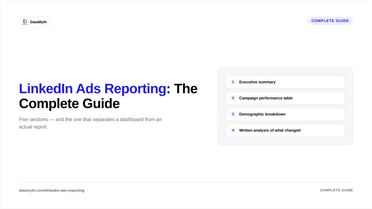
LinkedIn Ads Reporting: The Complete Guide for Marketers & Agencies

LinkedIn Ads reporting looks deceptively similar to Google or Facebook reporting until you actually build one, and then the differences show up fast: B2B sales cycles are longer, CPCs are higher, and the audience data (job title, seniority, company size) is uniquely valuable and easy to bury in a generic dashboard. This guide covers how to structure LinkedIn ads reporting properly, from the metrics that matter to how often to send it.

Why LinkedIn Ads Reporting Needs a Different Approach

Most paid reporting templates default to impressions, clicks, and CTR, metrics built for high-volume, low-CPC platforms. LinkedIn ads reporting works differently because the platform’s real strength is audience precision, not volume. A good LinkedIn ads report leads with lead quality and demographic targeting data, not raw reach.

Core Sections of a LinkedIn Ads Report

1. Executive summary

Total spend, total leads, cost per lead, and one line on the trend versus the prior period. Non-marketing stakeholders should be able to read just this section and understand performance.

2. Campaign performance table

Every active campaign ranked by cost per lead, with budget, impressions, clicks, and leads shown alongside. For the step-by-step process of pulling this together, see how to create a LinkedIn Ads performance report.

3. Demographic breakdown

Performance by job title, seniority, and company size, LinkedIn’s uniquely valuable targeting data that platforms like Google and Meta simply don’t offer at the same depth.

4. Creative performance

Top and bottom-performing ads by CTR and conversion rate, with a clear recommendation on what to scale or pause.

5. Written analysis of what changed

This is the step that separates a LinkedIn ads dashboard from an actual report. A table of numbers still requires someone to explain the “why.” DataMyth’s LinkedIn Ads report generates that written performance analysis automatically, ranked by degree of impact, so the report is ready to send without hours of manual commentary.

LinkedIn Ads Reporting Metrics That Actually Matter

– Cost per lead (CPL) — the primary efficiency metric, more relevant than CPC for most B2B campaigns
– Lead form completion rate — flags friction in the conversion step itself
– CTR and CPC — useful as supporting metrics, not headline ones
– Frequency — high frequency on a small audience often signals fatigue before CTR drops
– Cost per qualified lead — where possible, layering in lead quality data (not just volume) from your CRM
Building the LinkedIn Ads Dashboard
1. Connect Campaign Manager to your reporting tool via API so data refreshes automatically rather than requiring manual export.
2. Set the comparison period (month-over-month is standard for B2B given longer sales cycles).
3. Prioritize demographic data in the layout, this is the section clients ask about most since it’s unavailable elsewhere.
4. Automate the written narrative so account managers aren’t manually drafting commentary every reporting cycle. DataMyth’s LinkedIn Ads dashboard template is a ready-built starting point.

Common Mistakes in LinkedIn Ads Reporting

A handful of recurring errors show up across most LinkedIn ads reporting setups. Leading with CTR or CPC as the headline metric is the most common, since those numbers almost always look worse than a Google Ads or Facebook Ads equivalent and can make a genuinely healthy campaign appear to be underperforming to a client who isn’t expecting the difference. Ignoring frequency until CTR has already declined is another, on LinkedIn’s smaller, more precisely targeted audiences, frequency climbs faster than on broad consumer platforms, and catching it early prevents unnecessary budget waste on an audience that’s already seen the ad enough times. Finally, treating every lead as equal in the report, without any quality signal from the CRM, tends to overstate or understate a campaign’s real impact, since a campaign generating fewer, higher-quality leads can be outperforming one generating more, lower-quality leads even though the raw lead count says otherwise.

Structuring LinkedIn Ads Reporting for Different Stakeholders

The same underlying LinkedIn ads reporting data often needs to be presented differently depending on who’s reading it. A CMO or VP of Marketing typically wants the executive summary and campaign table, focused on efficiency and trend. A sales leader cares most about the demographic breakdown and lead quality, since that’s what determines whether marketing is actually reaching the accounts sales wants to talk to. A CFO or finance stakeholder wants spend and cost-per-lead trends tied clearly to budget, with minimal platform jargon. Building one underlying dataset with a few different presentation views, rather than three separate manual reports, is how agencies keep this manageable without tripling their reporting workload.

LinkedIn Ads Reporting for Different Campaign Objectives

Not every LinkedIn campaign is optimizing for lead generation directly, and the report structure should reflect that. Brand awareness campaigns should lead with reach, frequency, and video view rate rather than cost per lead, since lead generation isn’t the immediate goal. Website visit campaigns sit in between, useful to track click-through rate and landing page engagement alongside softer conversion signals like time on site. Lead generation campaigns, the most common use case for LinkedIn ads reports, should follow the cost-per-lead-first structure covered above. Mixing objectives into one undifferentiated report, treating an awareness campaign’s low CTR the same way as a lead-gen campaign’s low CTR, is one of the more subtle ways LinkedIn ads reporting goes wrong even when the individual metrics are accurate.

How Often Should LinkedIn Ads Reports Go Out?

Monthly is standard for most B2B accounts, given longer consideration cycles and lower daily data volume compared to consumer platforms. Weekly reporting is worth considering only during active testing phases or new campaign launches.

LinkedIn Ads Reporting vs. Other Channels

LinkedIn ads reporting differs most from Google or Facebook reporting in what counts as a “good” number, a CPC that looks alarming on Google Ads is often normal on LinkedIn given the audience precision being paid for. See our full comparison in LinkedIn Ads vs Google Ads reporting for how the two report structures actually diverge.
LinkedIn’s own Marketing Solutions resources note that B2B buying committees increasingly involve five or more stakeholders, reinforcing why demographic and seniority breakdowns matter more in LinkedIn reporting than in most other paid channels.

How to Automate Marketing Reports for Multiple Clients

One client’s report is manageable. Twenty clients’ reports, each on a different schedule, with different KPIs and different branding, is where reporting quietly becomes a full-time job for someone on your team. Here’s how agencies actually automate marketing reports for multiple clients without hiring a dedicated reporting person. The goal isn’t to automate marketing reports for multiple clients individually, it’s to build one repeatable process the whole roster runs through.

The Real Bottleneck Isn’t Data, It’s Repetition

Most agencies already have the data. The bottleneck is that every client report is rebuilt slightly differently: different logo, different date range, different written summary. Agency reporting automation solves this by standardizing the process once and letting the system repeat it per client, not by making each individual report faster to build by hand. This is the core reason agencies invest time to automate marketing reports for multiple clients rather than just automating one account at a time.

How to Scale Automated Reporting Across Your Client Roster

1. Standardize before you automate

You can’t automate chaos. Group clients into a small number of report types (SEO-only, paid-media, full-funnel, e-commerce) before connecting any tools. This is the single biggest predictor of how smoothly reporting multiple clients goes at scale, and it’s the step most agencies skip when they try to automate client reporting too quickly, which is also why so many attempts to automate marketing reports for multiple clients stall out after the first month.

2. Connect data sources at the account level, once

Rather than reconnecting platforms client by client, use a reporting tool that lets you link each client’s GA4, Google Ads, Facebook Ads, LinkedIn Ads, and Search Console accounts under one workspace, so onboarding a new client is a connection, not a rebuild.

3. Use white-label templates per report type

Branding still needs to be client-specific even when the underlying report structure is shared. DataMyth’s white-label reporting tools let you apply each client’s logo automatically to a shared template, so one build serves every client in that category.

4. Automate the written analysis at scale

This is where manual processes break down fastest, writing individual commentary for 20+ clients every month is not sustainable. Automated marketing reports that generate the “why” behind each metric shift automatically remove this bottleneck entirely, regardless of how many accounts you’re running. This single step is usually what determines whether an agency can genuinely automate marketing reports for multiple clients or is only automating the easy half of the job.

5. Stagger delivery schedules

Not every client needs their report on the same day. Stagger delivery (some clients Monday, others mid-month) so your team’s review window doesn’t collapse into a single overwhelming day. This kind of staggering only works once you’ve committed to automate marketing reports for multiple clients as a system, not as a series of one-off setups. Full setup steps are in how to schedule automated client reports.

Agencies that get these five steps right find that agency reporting automation scales almost linearly, adding the tenth client takes barely more effort than adding the second.

What Changes When You Scale From 1 Client to 50

Handful of Clients Large Roster
Report building Manageable manually Requires templated automation
Written analysis One person can keep up Bottlenecks without automation
Branding Case-by-case Needs white-label templates
Delivery Ad hoc Needs scheduled, staggered delivery

This table alone explains why agencies that automate client reporting early avoid the operational strain that shows up once the client roster hits double digits.

Getting this structure right is what makes reporting multiple clients sustainable as the roster grows, rather than something that quietly requires another hire every time you add ten accounts.

Signs You’ve Outgrown Manual Reporting

Not sure whether it’s time to automate marketing reports for multiple clients yet? A few reliable signals: your team spends more than a day each month just assembling reports rather than analyzing them; report quality visibly varies depending on which account manager built it; new client onboarding always includes “build their report template” as a multi-hour task; or a single team member out sick delays reports for several accounts at once. Any one of these is a sign the manual process has already outgrown the team’s capacity, even if no one has said so out loud yet.

Rolling Out Automation Without Disrupting Current Clients

Switching an entire client roster to automated reporting at once is risky, if something’s misconfigured, it affects every account simultaneously. A safer rollout: pick one report category (say, your paid-media clients), migrate that group first, run it alongside the old manual process for one cycle to confirm accuracy, then expand to the next category. This staged approach to agency reporting automation catches template or data issues on a small group before they touch your entire client list, and it gives your team time to get comfortable reviewing automated output instead of building it from scratch.

Multi-Channel, Multi-Client: Where Paid Media Fits

Agencies running paid campaigns across several platforms per client add another layer of complexity. DataMyth’s paid media performance report consolidates Google Ads, LinkedIn Ads, and Facebook Ads into one view per client, which matters more, not less, as your client count grows.

Content Marketing Institute’s B2B research consistently finds that measurement and reporting are cited as one of the top operational drains for growing agencies and in-house teams alike, reinforcing why the multi-client reporting bottleneck is worth solving early rather than after it’s already causing account manager burnout. Agencies that automate client reporting at the roster level, not just per account, tend to solve this before it becomes a hiring problem.

Quick Recap: Automating Reports Across Many Clients

To automate marketing reports for multiple clients successfully, standardize report types first, connect data sources at the account level, apply white-label templates per category, and automate the written analysis so agency reporting automation doesn’t collapse under its own volume as the roster grows. The agencies that scale reporting multiple clients smoothly are the ones that fix the process before adding more accounts, not after.

How to Automate Client Performance Reports

Performance reports carry more weight than a quick status update, they’re where clients decide whether the campaign, and the agency, is working. That’s exactly why manually building them is so expensive: pulling data from four platforms, cross-checking numbers, and writing a coherent analysis can eat half a day per client. Here’s how to automate client performance reports without losing the quality clients expect. Whether you manage two accounts or two hundred, the process to automate client performance reports stays largely the same, only the scale changes.

Why Performance Reports Are Harder to Automate Than Status Reports

A status report is a snapshot. A performance report has to explain trends over time, tie results back to goals, and usually needs a written narrative a client can act on, which is why teams look to automate client performance reports specifically rather than treating all reporting as one task. Client performance reporting done manually means someone is reading a chart and translating it into English every single month, for every single account.

How to Automate Client Performance Reports in 5 Steps

1. Define the KPIs that matter per client

Before building any automated performance reports, lock in three to five headline metrics per account (cost per lead, ROAS, organic conversions, etc.). Automating the wrong metrics just makes bad reporting faster. DataMyth’s guide on digital marketing KPIs for agency reporting is a useful starting point if this step isn’t locked in yet.

2. Connect every relevant data source

Link GA4, Google Ads, Facebook Ads, LinkedIn Ads, and Google Search Console through secure OAuth connections once, so the platform pulls fresh numbers automatically each cycle instead of someone exporting CSVs.

3. Automate the comparison period, not just the current number

A number without context is meaningless to a client. Automated systems should compare the current period against the prior period (or the prior year) by default, so trend direction is visible without manual calculation.

4. Let the tool write the “why,” not just the “what”

This is where most reporting automation stops short. Dashboards show what changed; they rarely explain why. DataMyth’s automated analysis engine identifies which KPI moved the most and generates a written explanation of the likely cause, closing the gap between a chart and an actual automated client report a client can read without a call.

5. Build once, reuse per client type

Create a performance report template per channel or client tier (SEO-only, paid-media, full-funnel) so scaling to a new client means assigning a template, not building a new report from zero.

Together, these five steps are the fastest route to fully automated performance reports, not partial automation that still leaves the written analysis to a person.

Common Mistakes That Undermine Automated Performance Reports

Even agencies that automate client performance reports still run into a handful of recurring problems:

  • Automating before defining KPIs. Connecting data sources first and figuring out what to measure later usually produces a report packed with numbers and no clear story. Fix the KPI list before touching any tool.
  • Skipping the comparison period. A single-period number, without a prior-period or prior-year comparison, tells a client almost nothing about direction. Every automated performance report should default to showing change, not just current state.
  • Treating the dashboard as the finished report. A live dashboard is a working tool for the account team; a client-facing performance report needs a fixed layout, a written summary, and a delivery date, not just a link to a chart.
  • Letting templates drift per client. If every account manager tweaks the template slightly, you lose the consistency that makes reporting automation worth the setup effort in the first place.

How to Judge Whether Your Automation Is Actually Working

A genuinely automated client report should pass a simple test: could a new account manager, unfamiliar with the client, read it and understand what happened and why without asking anyone a question? If the answer is no, the automation is only handling the data pull, not the analysis, which is usually the more time-consuming half of the job. Reports that still require someone to “translate” the chart before sending it haven’t actually automated client performance reports, they’ve automated the easy 30% and left the hard 70% manual.

What to Include in an Automated Performance Report

  • Executive summary with the single most important trend
  • KPI table with period-over-period comparison
  • Written explanation of the biggest movers
  • Channel breakdown (if multi-channel)
  • Recommendations or next steps

Manual vs. Automated Performance Reporting

Manually assembling a performance report typically takes agencies 1–3 hours per client per month, most of it spent in the “write the commentary” phase rather than pulling the data itself. Automating both the data pull and the written analysis is what actually compresses that time, tools that only automate the dashboard still leave the slowest part, the writing, to a person. For a full breakdown of that gap, see manual vs. automated client reporting.

Where This Fits With Multi-Client Scaling

Automating one client’s performance report is useful. Automating the process across your entire client roster is what actually returns hours to your team’s week. If you’re managing reporting across a large client list, pair this with our guide on how to automate marketing reports for multiple clients.

Search Engine Land’s ongoing coverage of marketing measurement trends consistently points to the same conclusion: agencies that spend less time compiling reports spend more time on strategy, which is the actual differentiator clients pay for.

Quick Recap: Automating Client Performance Reports

To automate client performance reports well, lock in the KPIs first, connect data sources once, automate both the comparison period and the written analysis, and reuse the same template across similar accounts. Agencies that only automate the dashboard and skip the analysis still end up writing automated client reports by hand every month, the real time savings in client performance reporting come from automating the narrative, not just the numbers.

Google Search Console Dashboard Template: What Should It Include?

Google Search Console’s native interface is built for auditing, not presenting. It’s exactly what you need when diagnosing a ranking drop, and exactly the wrong thing to screen-share with a client. A proper Google Search Console dashboard template translates that raw data into something a non-technical stakeholder can actually read in under a minute.

Why the Native GSC Interface Doesn’t Work as a Client Dashboard

Search Console shows data table by table, queries, pages, countries, devices, with no narrative and no fixed comparison period unless you set one manually every visit. A GSC dashboard template solves this by fixing the layout, the comparison window, and the metrics that matter into a single reusable view, which is the whole point of building a Google Search Console dashboard template instead of relying on the raw interface each time.

What to Include in a Google Search Console Dashboard Template

1. Total clicks and impressions, with trend

The headline numbers, shown against the prior period so direction is obvious at a glance rather than requiring the viewer to do the comparison mentally.

2. Average CTR and average position

These two metrics together tell you whether visibility (position) or appeal (CTR) is the bigger lever to pull, which matters for prioritizing next steps.

3. Top pages by clicks

Which URLs are actually earning organic traffic, useful for identifying both high performers and pages that are ranking but underperforming on CTR.

4. Top queries by clicks and impressions

The keyword-level view. For the full breakdown of what belongs here, see our guide on what to include in an organic keywords report.

5. Indexing and coverage status

Pages indexed vs. excluded, and any crawl errors. This section rarely changes month to month but is critical to flag immediately when it does.

6. Device and search appearance breakdown

Mobile vs. desktop performance, and whether rich results (like FAQs or reviews) are appearing in search, both of which affect CTR independent of ranking.

7. Comparison period selector and trend arrows

A well-built dashboard doesn’t just show current numbers, it visually flags direction (up, down, flat) next to every metric so a viewer can scan the whole page in seconds rather than reading each figure individually. This is a small design detail that has an outsized impact on how usable the dashboard actually feels to a non-technical client.

Choosing the Right Layout for a Search Console Dashboard

Not every audience needs the same view. An account manager preparing for a monthly client call typically wants the full six-section layout above, with room to dig into individual queries if a question comes up live. A client-facing summary, sent as a PDF or shared link rather than presented on a call, usually works better trimmed down to three sections: the headline trend, top queries, and one written takeaway, since most stakeholders skim rather than study. Building both a “full” and a “summary” version of the same Google Search Console dashboard template, pulling from the same underlying data, avoids maintaining two separate reporting processes for what’s really one dataset presented two ways.

Setting Up the Data Connection Correctly

A dashboard is only as reliable as its data connection. A few setup details worth getting right from the start: confirm the Search Console property matches the domain or URL prefix actually being reported on, since a mismatched property (www vs. non-www, for instance) can silently show incomplete data. Set the date range to exclude the most recent two to three days, Search Console data typically has a short reporting lag, and including those days can make the most recent period look artificially low. Finally, decide early whether the dashboard will track a single property or aggregate multiple properties (useful for multi-domain or multi-region sites), since retrofitting that decision later usually means rebuilding the dashboard from scratch.

Building the Dashboard: Practical Steps

  1. Connect Search Console via API rather than manual CSV export, so the Search Console dashboard updates automatically instead of going stale between reports.
  2. Fix the comparison period (month-over-month is standard) so every dashboard view is consistent.
  3. Layer in written analysis. A dashboard full of tables still requires interpretation; tools like DataMyth’s Google Search Console report pair the dashboard with an automatically generated explanation of what changed, which is usually the piece that turns a dashboard into a report a client actually understands.
  4. Combine with GA4 where relevant. Search Console shows visibility; GA4 shows what happens after the click. Our organic search reporting guide covers how the two fit together into one report.

Common Pitfalls With Search Console Dashboards

A few issues show up repeatedly once teams start relying on a live dashboard rather than pulling data manually each time: filtering by the wrong search type (web vs. image vs. video) without realizing it, which can dramatically understate performance if the default filter excludes relevant traffic; forgetting to exclude branded queries when the goal is measuring non-branded visibility growth; and treating a temporary CTR dip as a ranking problem when it’s actually caused by a SERP feature change, like a competitor earning a featured snippet, that Search Console data alone won’t explain without cross-referencing what the actual results page looks like.

Ready-Made Template

If you’d rather start from a built template than build one from scratch, DataMyth’s Google Search Console dashboard template covers all six sections above out of the box, with automated analysis included, so you’re not building a Google Search Console dashboard template from a blank canvas.

Google’s own Search Console documentation recommends checking Performance data regularly rather than only when something looks wrong, which is the strongest argument for a standing dashboard over an ad hoc login-and-check habit.

Organic Search Reporting: The Complete Guide

SEO results are slow, cumulative, and easy to undersell in a report that only shows last month’s traffic number. Organic search reporting exists to fix that, turning ranking movement, clicks, and behavior data into something a client can actually see progress in. This guide covers what belongs in an organic search report, which tools to pull data from, and how to structure it so SEO’s value is obvious, not implied. Whether you’re building your first organic search report or refining one that’s already in rotation, the structure below applies to both.

What Organic Search Reporting Actually Measures

Organic search reporting sits at the intersection of two data sources: Google Search Console, which shows how a site performs in search results (impressions, clicks, average position), and GA4, which shows what happens after someone clicks through (sessions, engagement, conversions). Good SEO reporting combines both rather than relying on just one.

The Core Sections of an Organic Search Report

1. Organic traffic overview

Sessions, users, and conversions from organic search, compared to the prior period. This is the top-line number stakeholders look for first.

2. Organic keywords report

A breakdown of which queries are driving impressions and clicks, and how rankings have shifted. This section deserves its own depth, see our full guide on what to include in an organic keywords report.

3. Search Console performance data

Click-through rate, average position, and impression trends by page and query. For dashboard structure specifically, see the Google Search Console dashboard template guide.

4. Landing page performance

Which pages are earning organic traffic, and whether that traffic converts. This connects organic performance reporting to actual business outcomes, not just visibility.

5. Technical and indexing health

Crawl errors, indexing status, and Core Web Vitals, sourced directly from Search Console, flagged when they’re likely affecting performance.

Building an Organic Search Report: Step by Step

  1. Connect GA4 and Google Search Console to your reporting tool so both data sources update automatically.
  2. Set a consistent comparison period (month-over-month or year-over-year) so trend direction is always visible.
  3. Segment by page type or campaign if the site has distinct sections (blog, product pages, landing pages) that perform differently.
  4. Add written analysis, not just charts. A SEO reporting dashboard full of graphs still requires someone to explain what moved and why; automated platforms like DataMyth’s organic search report generate that explanation using an Acquisition–Behaviour–Conversion model, so the report reads like an analyst wrote it.
  5. Schedule delivery on a monthly cadence, SEO moves too slowly for weekly reporting to be meaningful in most cases.

Together, these five sections form the backbone of every solid organic search reporting structure, whether built manually or through an automated platform.

Setting Realistic Benchmarks for Organic Search Reporting

One of the fastest ways to lose a client’s trust in organic search reporting is presenting a number with no sense of whether it’s good or bad. A few grounding points worth including in the report itself or the surrounding conversation: organic click-through rate typically falls between 2% and 5% for positions outside the top three, so a low CTR on a page ranking position 8 isn’t necessarily a problem to fix, it may just reflect where it sits. Ranking movement of one or two positions month to month is normal noise, not signal; meaningful trend usually needs a three-month window to separate real change from algorithm-update jitter. Organic traffic reporting should always be read in the context of seasonality too, a retail client’s organic traffic dipping in February against a January peak isn’t underperformance, it’s a calendar effect the report should call out explicitly rather than leave the client to wonder about.

How Organic Search Reporting Differs by Site Type

A content publisher, an e-commerce store, and a B2B SaaS site all need organic search reporting, but the emphasis shifts considerably:

  • Content and media sites should weight pageviews per session and returning visitor rate alongside traffic, since content consumption patterns matter as much as raw sessions.
  • E-commerce sites need organic reporting tied directly to revenue per session and product-page performance, not just top-of-funnel traffic, since traffic without purchase intent isn’t the goal.
  • B2B and lead-gen sites should connect organic traffic to form completions and, where possible, sales-qualified leads, since a spike in blog traffic that never converts isn’t the win it looks like on a traffic chart alone.

Building the report structure around the business model, rather than a generic template, is what separates SEO reporting that actually informs decisions from SEO reporting that just documents activity.

Organic Search Reporting vs. Paid Search Reporting

Organic and paid search reporting share a data source (Google) but different logic entirely. Paid reporting is about spend efficiency; organic reporting is about compounding visibility over time, which is why organic reports need longer comparison windows and more emphasis on trend direction than week-to-week snapshots.

Common Mistakes in Organic Search Reports

  • Only reporting sessions, without connecting traffic to conversions or revenue
  • Ignoring Search Console entirely and relying only on GA4, which misses ranking and impression data
  • No written context, leaving clients to interpret a line graph on their own
  • Inconsistent comparison periods that make trends look worse or better than reality

According to Google’s own Search Central documentation, Search Console data is intended to be read alongside analytics data specifically because neither source tells the full story alone, which is the core argument for combining both in every organic search report.

Quick Recap: Building an Organic Search Report

Strong organic search reporting combines Search Console visibility data with GA4 behavior data, adds written analysis instead of raw charts, and sticks to a consistent monthly comparison period. Agencies that treat SEO reporting as just a traffic chart tend to undersell SEO’s real impact; agencies that build a proper organic performance reporting structure make that impact obvious.

Organic Keywords Report: What Should You Include?

An organic keywords report is the section of SEO reporting clients pay the most attention to, and the section most agencies build worst. A raw export of 200 queries with no context isn’t a report, it’s a spreadsheet. Here’s what actually belongs in an organic keywords report, and how to structure the organic keywords report so the data means something.

Why the Keywords Section Matters More Than the Traffic Chart

Traffic charts show the result. The organic keywords report shows the mechanism, which specific queries are earning visibility, which are slipping, and where the opportunity sits. Clients who understand why traffic changed trust the report, and the agency, more than clients who are just shown a line going up or down. This is the single biggest reason a well-built organic keywords report outperforms a generic traffic summary in client conversations.

What to Include in an Organic Keywords Report

1. Top-performing keywords by clicks

The queries actually driving traffic, not just impressions. Impressions without clicks usually indicate a ranking or CTR problem worth flagging separately.

2. Ranking movement, not just current position

Show position change over the reporting period, not a static snapshot. A keyword sitting at position 8 that moved from position 14 is a different story than one that’s been stuck at 8 for three months.

3. Click-through rate by query

CTR variance across similarly-ranked keywords often points to a title tag or meta description issue rather than a ranking problem, worth calling out explicitly in the report.

4. New and lost keywords

Which queries started ranking this period, and which dropped out entirely. This is one of the clearest signals of content or technical changes taking effect.

5. Branded vs. non-branded split

Branded search inflates traffic numbers without reflecting real SEO growth. Separating the two gives a far more honest read on organic performance.

6. Striking-distance keywords

Queries ranking between positions 4–15, close enough to page one that small optimizations can move them. This section doubles as a forward-looking action item, not just a historical record.

7. Keyword grouping by intent

Individual query rows only tell part of the story. Grouping queries into intent clusters, informational, commercial, navigational, transactional, shows a client whether growth is coming from top-of-funnel awareness content or bottom-of-funnel, revenue-driving terms. A report showing “organic clicks up 20%” reads very differently once it’s clear that growth came entirely from informational blog queries rather than commercial intent terms closer to a purchase decision.

8. Page-to-query mapping

Beyond which queries perform well, show which pages are earning that performance. A single high-value query ranking well on the wrong page (a blog post instead of a product page, for instance) is a finding worth surfacing directly in the organic keywords report, since it often points to an internal linking or content-mapping fix rather than a ranking problem at all.

How to Prioritize What Goes Into the Report

Not every query Search Console tracks deserves a row in the report. A practical filter: include queries with meaningful impression volume (enough to be statistically stable month to month), queries tied to commercial or high-value informational intent, and queries showing notable movement, up or down, since the last reporting period. Long-tail queries with a handful of impressions each are better summarized in aggregate (“214 additional long-tail queries generated 340 clicks this period”) than listed individually, which keeps the organic keywords report focused on what actually matters to the business rather than complete for its own sake.

Turning the Keywords Report Into Action Items

The best organic keywords reports don’t just document what happened, they point to what to do next. Striking-distance keywords (positions 4–15) are the clearest example: flag the three or four closest to page one, along with a one-line note on what would likely move them, a title tag rewrite, an added internal link, a content refresh, so the report doubles as a working to-do list rather than a static summary a client reads once and files away. This is also where automated analysis earns its keep: instead of a person manually reviewing every query’s position trend to spot opportunities, a platform like DataMyth can surface the highest-impact striking-distance terms automatically each month.

Where This Data Comes From

Every section above pulls from Google Search Console’s Performance report, which tracks queries, clicks, impressions, CTR, and average position at the query and page level. Automated tools like DataMyth’s Google Search Console report surface this organic keywords report data alongside a written explanation of what changed and why, removing the need to manually cross-reference dozens of individual queries each month.

This section is one piece of a larger organic search report. For the full report structure, see our complete guide to organic search reporting.

Common Errors When Building an Organic Keywords Report

Even experienced teams run into a few recurring issues when pulling this section together. Mixing branded and non-branded terms into one ranking average is one of the most common, it flattens a genuinely strong non-branded improvement by averaging it with an already-high branded position. Reporting raw position numbers without impression volume is another, a query that jumped from position 18 to position 9 looks impressive until you notice it only generates a handful of impressions a month, while a query stuck at position 12 with thousands of impressions is the one actually worth investing in. Finally, presenting the keywords table without any narrative forces the client to draw their own conclusions from a spreadsheet, which is exactly the gap a short written summary at the top of every organic keywords report is meant to close.

A Simple Organic Keywords Report Template

Query Clicks Impressions CTR Avg. Position Change
Example query 1 145 3,200 4.5% 6.2 ▲ 2.1
Example query 2 88 1,900 4.6% 9.8 ▼ 1.4
Example query 3 210 5,500 3.8% 4.9 ▲ 0.6

Keep the table focused, 15 to 25 rows covering the most important queries, rather than exporting every keyword the site ranks for. Moz’s guide to keyword tracking makes a similar point: tracking too many low-value keywords dilutes the signal that actually helps decision-making.

Marketing Report Examples: What Strong Reports Include (and What Weak Ones Leave Out)

Marketing report examples from strong agencies share a set of structural and content characteristics that are consistently present and consistently absent from reports that underperform on client satisfaction. Looking at what the best reports include, and annotating why it works, is more useful for improving your own reporting than any general advice about “being more strategic.”

This guide breaks down the key sections of strong marketing report examples and examines what makes each one effective.

What Does a Strong Executive Summary Look Like?

The executive summary is the highest-read section of any marketing report and the most commonly wasted. Strong marketing report examples use the executive summary to communicate three things only: the verdict, the primary driver, and the recommendation.

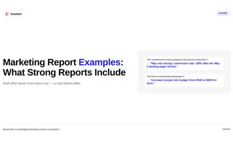
Weak executive summary example: “This month we continued to make progress across the key channels and saw some improvements in performance metrics overall. We are monitoring several areas and will continue to optimise going forward.”

What is wrong: No verdict. No specific data. No recommendation. The client cannot determine from this summary whether the month was good or bad, what caused any change, or what is happening next.

Strong executive summary example: “May was a strong month, driven by a 28% increase in Google Ads conversion rate following the landing page refresh we implemented on May 2nd. Total leads generated reached 47, above the monthly target of 40. Organic traffic continues to grow (up 14% year-over-year) as a result of the four long-form articles published in Q1. For June, we recommend increasing the Google Ads budget by 15% to capitalise on the improved conversion rate while competitive CPCs remain below seasonal average.”

What works: Specific verdict (strong month). Specific cause (landing page refresh, with date). Specific data against target (47 vs target 40). Specific YoY context for organic. Specific recommendation with rationale and timing.

The executive summary should be 150-250 words, specific enough that a client reading only this section understands the period’s performance and the proposed next action.

What Does a Strong Channel Performance Section Look Like?

Marketing report examples with strong channel sections follow a consistent structure: headline metric (large, with comparison), supporting metrics table, trend chart, and written analysis.

Annotated paid search channel section

Headline metric (large KPI tile): Conversions: 47 (vs 38 prior month, +24%)

Supporting metrics table:

Metric This month Last month Change
Impressions 124,000 118,000 +5%
Clicks 3,890 3,650 +6.6%
CTR 3.1% 3.1% 0%
Avg CPC $4.20 $4.40 -4.5%
Conversions 47 38 +23.7%
Conversion rate 1.21% 1.04% +16.3%
Cost per conversion $347 $430 -19.3%
Total spend $16,300 $16,340 -0.2%

Trend chart: Line chart: Conversions and Cost per Conversion over 12 months (both lines, labelled clearly)

Written analysis (the most important part): “Conversion rate improved from 1.04% to 1.21% this month, driving 9 additional conversions at effectively the same spend level. The primary driver was the updated landing page launched May 2nd, which improved form completion by 18% in the first two weeks. CTR was flat month-over-month, suggesting the ad copy is performing consistently, no creative refresh is needed this cycle. CPC decreased slightly as two higher-bid competitors appear to have reduced spend, creating more efficient auction conditions. We will monitor CPC in June as seasonal competition typically increases in the second half of the year.”

What makes this analysis strong: it attributes the improvement to a specific cause (landing page, with date), quantifies the specific improvement, explains what did not change and why (flat CTR, no action needed), and identifies an emerging risk (seasonal CPC increase) to monitor.

What Does a Strong Recommendations Section Look Like?

Marketing report examples that drive strong client trust include a recommendations section that is specific, data-backed, and forward-looking. Weak recommendations sections are vague or absent entirely.

Weak recommendations:

  • “Continue optimising campaigns”
  • “Test new creative”
  • “Monitor performance”

These are not recommendations. They are descriptions of what an agency always does.

Strong recommendations:

Recommendation 1: Increase Google Ads daily budget from $543 to $625 for June. Rationale: Conversion rate improved 16% in May with no increase in spend. Budget increase will capture additional conversion volume while the improved rate persists. Current search impression share is 68%; budget increase will address the 32% of eligible queries currently missed. Expected outcome: Projected 12-15 additional conversions at the improved CPL of $347. Action required: Client approval for budget increase.

Recommendation 2: Publish two additional blog articles targeting [keyword cluster] in June. Rationale: The four articles published in Q1 have produced 14% YoY organic traffic growth. The next topic cluster in the content calendar (identified in Q1 strategy session) targets queries with 2,400 monthly search volume and no current ranking content. Expected outcome: Initial ranking signals within 30-60 days; traffic contribution visible in August reporting. Action required: Agency writing, client review for factual accuracy.

Strong recommendations include: what to do, why (with specific data), expected outcome, and who needs to do something. Each recommendation is actionable within the next reporting period.

What Does Good Written Analysis Look Like in a Marketing Report?

Across marketing report examples from high-performing agencies, the written analysis follows a consistent pattern:

What changed: One sentence naming the metric and the direction of movement. “Organic sessions from branded search increased 32% month-over-month.”

Why it changed: One to two sentences attributing the cause. “The increase correlates with the LinkedIn thought leadership campaign that ran from May 5-20, which generated 2,400 new profile visits and 140 website clicks from LinkedIn directly.”

What it means: One sentence connecting the data to the client’s goal. “This suggests the awareness campaign is building brand recognition among the target professional audience and driving them to research the brand directly.”

What happens next: One sentence forward-looking. “We expect this trend to continue through June as the LinkedIn campaign continues, with a potential plateau in July when the campaign budget resets.”

This four-sentence framework applies to every metric section in the report. It takes 3-4 minutes per metric section to write and transforms the report from a data delivery into an analytical service.

How Do You Handle Negative Results in a Marketing Data Presentation?

Presenting marketing data that shows underperformance is the moment that most separates strong agencies from weak ones. The instinct is to minimise the bad news, lead with positive metrics, bury the underperformance in a secondary section, or frame it as “an area of opportunity.”

The correct approach is the opposite: acknowledge the underperformance directly in the executive summary, explain the cause specifically, and present a corrective action with a timeline.

A client who reads a report that honestly presents a difficult month and provides a clear explanation and action plan trusts the agency more, not less. The trust damage comes not from the bad result but from discovering that the agency knew about the problem and did not say so.

The language for presenting underperformance should be direct but not catastrophising: “Cost per lead increased 32% month-over-month, driven by [specific cause]. We are implementing [specific action] to address this, with results visible in the June reporting cycle.” Specific, owned, forward-looking.

DataMyth generates this four-part analysis automatically for each channel’s performance data, producing the written narrative as a starting draft that the account manager reviews and refines. The time saving is substantial — from 60-90 minutes of analysis writing per client to 15-20 minutes of review and editing. See DataMyth’s written analysis generation.

Google Ads Performance Report: How to Build One That Non-Technical Clients Understand

A Google Ads performance report that is built for an account manager to review internally and a Google Ads performance report built for a client to read are two very different documents. The internal version can show Quality Scores, impression share breakdowns, bid modifier performance, and auction insights. The client-facing version should show whether the investment is producing the business outcomes the client cares about, with enough context to explain why.

Most agencies produce a version somewhere between the two: too much data for an executive but not enough for an analyst. This guide covers how to build a Google Ads performance report that communicates clearly at the client level without hiding the analysis that informs the agency’s work.

What Metrics Belong in a Google Ads Performance Report?

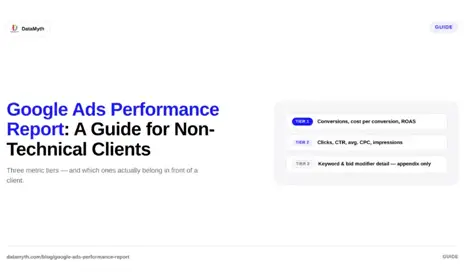
A client-facing Google Ads performance report should include metrics in three tiers: headline business metrics, channel efficiency metrics, and diagnostic metrics.

Tier 1: Headline business metrics (most prominent)

These are the metrics that directly answer “is this investment worthwhile?” They belong in the KPI tile section of the report and carry the highest visual weight.

Metric What it answers Client-facing label
Conversions Did the campaign produce the goal event? Leads generated / Purchases / Bookings
Cost per conversion How much did each result cost? Cost per lead / Cost per purchase
Revenue (ecommerce) How much revenue did the campaign produce? Revenue from Google Ads
ROAS (ecommerce) Did the spend return more than it cost? Return on ad spend
Conversion rate Of all clicks, how many converted? Click-to-conversion rate

Tier 2: Channel efficiency metrics (supporting)

These metrics provide context for the headline figures and explain the mechanism. They belong in the channel performance table, visible but not dominant.

Metric What it explains
Clicks Volume of traffic produced
CTR How well the ads attract clicks for the queries shown
Average CPC Cost of each click
Impressions How often the ads appeared
Average position / Impression share How visible the campaign is in auction
Quality Score Ad relevance and landing page quality (weekly check, not monthly report)

Tier 3: Diagnostic metrics (internal or appendix only)

Keyword-level performance, match type breakdowns, device bid modifier analysis, audience modifier performance. These are the metrics the agency uses to make optimisation decisions, not the metrics the client needs to evaluate the campaign’s business performance.

Including Tier 3 metrics in the main body of a client report adds complexity without adding client understanding. Move them to an appendix or keep them in internal analysis documents.

How Do You Frame Google Ads Data for Non-Technical Clients?

Google Ads performance report data requires translation for non-technical clients. The four most common translation challenges:

CTR. Clients often interpret a CTR below 5% as underperformance. The context: average CTR on Google Search is 6.11% across all industries (WordStream, 2024), but varies from 3.8% for legal services to 10.7% for arts and entertainment. The agency’s role is to provide the industry-specific benchmark, not just the number.

Impression share. “We achieved 72% impression share” means nothing to most clients. “Our ads appeared for 72% of the searches where they were eligible — the remaining 28% were missed due to budget limits” is clear and creates an actionable conversation about budget.

CPC. Average CPC varies from under $1 in some categories to $50+ in legal and financial services. Present CPC with the industry context: “Our average CPC of $8.40 is below the industry average of $11.20 for this category.”

Quality Score. Quality Score drives CPC and position but is a metric most clients do not understand without explanation. Consider including a brief explainer the first time it appears: “Quality Score (1-10) measures Google’s assessment of ad relevance and landing page quality. Higher scores reduce our cost per click. We are currently averaging 7/10, above the 5/10 baseline.”

How Should a Google Ads Performance Report Be Structured?

A complete Google Ads performance report for monthly client delivery:

Page 1: Executive summary Verdict on the month, primary driver of performance (positive or negative), and the top recommendation for the next period.

Page 2: Headline KPI tiles The Tier 1 metrics at large visual weight: conversions, cost per conversion, and ROAS or revenue for ecommerce accounts.

Page 3: Channel performance table and trend Tier 2 metrics in a table with period comparisons. Line chart of conversions and cost per conversion over the past 6-12 months. Written analysis of what drove the period’s performance.

Page 4: Campaign-level performance breakdown Which campaigns performed strongest, which underperformed, and why. This page connects the account-level story to the specific campaign decisions.

Page 5: Recommendations for next period Three to five specific, data-backed recommendations with expected outcomes.

Appendix (optional): Full keyword and ad-level data For clients who want detailed access to the underlying data. Labelled clearly as supplementary.

According to Google’s 2024 benchmark data, campaigns with a clear documented optimisation log (recording changes made and their measured impact) show 28% better performance improvement over 12 months than campaigns managed without systematic documentation. Including a “changes made this month” section in the Google Ads performance report serves both the client and the agency’s own optimisation discipline.

How Do You Automate Google Ads Performance Reporting?

Manual Google Ads performance report production involves: logging into Google Ads, setting the date range, selecting the metrics, exporting the data, cleaning and formatting it, building the charts, and writing the analysis. For 10 clients, this is 15-25 hours per month.

DataMyth automates this process by connecting to Google Ads via API, extracting the Tier 1 and Tier 2 metrics automatically each reporting cycle, and generating the structured report with written analysis of what changed and why. The account manager’s role becomes: reviewing the generated analysis, adding campaign-specific context (what changes were made and why), and writing the recommendations section.

This reduces the Google Ads reporting cycle from 90-150 minutes per client to 15-25 minutes. Connect Google Ads to DataMyth.

What Is the Right Reporting Cadence for Google Ads?

Google Ads performance report cadence should match the client’s campaign budget and the decision-making cycle. Three practical guidelines:

Monthly reporting is the standard for most clients. Monthly cycles provide enough time for meaningful performance changes to accumulate and enough data to draw statistically reliable conclusions about what is and is not working.

Weekly reporting is appropriate for high-budget campaigns (over $30,000/month spend) where performance variations can compound quickly, for ecommerce campaigns during peak seasons (Black Friday, holiday period), or when a significant campaign change is under active evaluation and requires fast feedback.

Bi-weekly reporting is a useful middle ground for clients who want more visibility than monthly but do not have the budget level to justify weekly. A bi-weekly cadence for the primary KPI metrics (conversions, CPL, spend pace) with a full monthly report covers most needs.

For most campaigns, a monthly report with a weekly performance alert system (automated alerts when conversions drop below threshold or CPC spikes above threshold) provides the right balance of regular visibility and strategic reporting depth.

What metrics should a Google Ads performance report include?

Tier 1 (headline): conversions, cost per conversion, ROAS, revenue. Tier 2 (supporting): clicks, CTR, average CPC, impressions, impression share. Tier 3 (internal/appendix only): keyword performance, bid modifier analysis. Most clients need Tier 1 and 2; Tier 3 is for the agency’s optimisation work.

How do I explain CTR to a non-technical client?

Provide the industry benchmark alongside the client’s number: “Our ads clicked 6.8% of the time they appeared, compared to the industry average of 4.2% for our category.” Context makes the number meaningful.

How should I structure a Google Ads client report?

Executive summary, headline KPI tiles, channel performance table and trend chart, campaign-level breakdown, and recommendations. Detailed keyword and ad-level data goes in the appendix for clients who want it.

What is impression share and how do I explain it to clients?

Impression share is the percentage of eligible searches where your ads appeared. “We appeared for 72% of relevant searches; the remaining 28% were missed due to budget limits” is the client-ready version.

How do I automate Google Ads reporting for multiple clients?

Connect your clients’ Google Ads accounts to DataMyth, which extracts the data automatically each cycle and generates the formatted report with written analysis. This reduces 90-150 minutes of manual work per client to 15-25 minutes of review.

Should I include Quality Score in a client report?

Not as a headline metric, but it can be included in the supporting table with a brief explanation. Quality Score is most useful as an internal diagnostic. Include it only if it is relevant to a specific conversation about CPC or position trends.