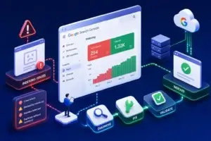
Google Search Console’s native interface is built for auditing, not presenting. It’s exactly what you need when diagnosing a ranking drop, and exactly the wrong thing to screen-share with a client. A proper Google Search Console dashboard template translates that raw data into something a non-technical stakeholder can actually read in under a minute.
Search Console shows data table by table, queries, pages, countries, devices, with no narrative and no fixed comparison period unless you set one manually every visit. A GSC dashboard template solves this by fixing the layout, the comparison window, and the metrics that matter into a single reusable view, which is the whole point of building a Google Search Console dashboard template instead of relying on the raw interface each time.
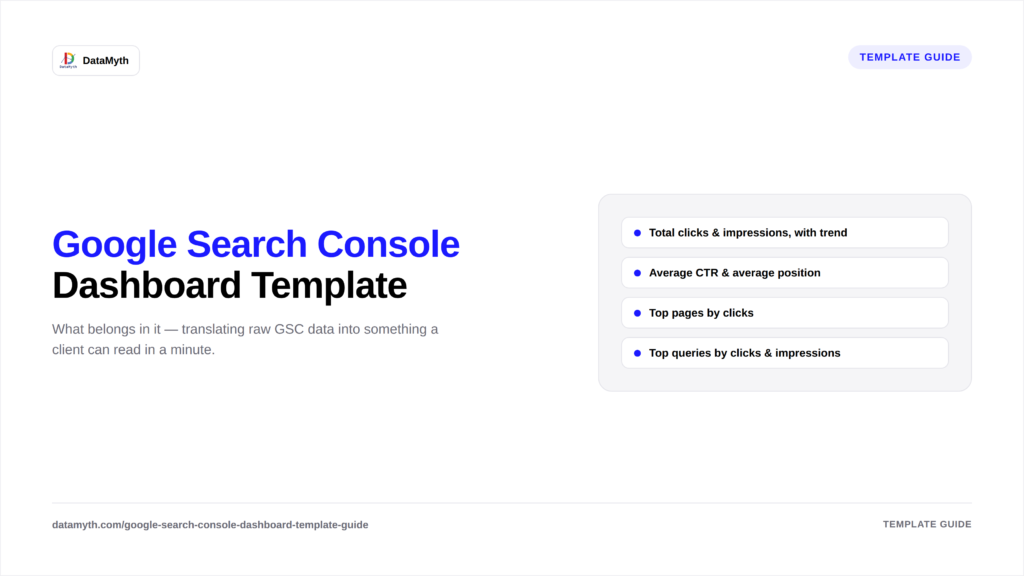
The headline numbers, shown against the prior period so direction is obvious at a glance rather than requiring the viewer to do the comparison mentally.
These two metrics together tell you whether visibility (position) or appeal (CTR) is the bigger lever to pull, which matters for prioritizing next steps.
Which URLs are actually earning organic traffic, useful for identifying both high performers and pages that are ranking but underperforming on CTR.
The keyword-level view. For the full breakdown of what belongs here, see our guide on what to include in an organic keywords report.
Pages indexed vs. excluded, and any crawl errors. This section rarely changes month to month but is critical to flag immediately when it does.
Mobile vs. desktop performance, and whether rich results (like FAQs or reviews) are appearing in search, both of which affect CTR independent of ranking.
A well-built dashboard doesn’t just show current numbers, it visually flags direction (up, down, flat) next to every metric so a viewer can scan the whole page in seconds rather than reading each figure individually. This is a small design detail that has an outsized impact on how usable the dashboard actually feels to a non-technical client.
Not every audience needs the same view. An account manager preparing for a monthly client call typically wants the full six-section layout above, with room to dig into individual queries if a question comes up live. A client-facing summary, sent as a PDF or shared link rather than presented on a call, usually works better trimmed down to three sections: the headline trend, top queries, and one written takeaway, since most stakeholders skim rather than study. Building both a “full” and a “summary” version of the same Google Search Console dashboard template, pulling from the same underlying data, avoids maintaining two separate reporting processes for what’s really one dataset presented two ways.
A dashboard is only as reliable as its data connection. A few setup details worth getting right from the start: confirm the Search Console property matches the domain or URL prefix actually being reported on, since a mismatched property (www vs. non-www, for instance) can silently show incomplete data. Set the date range to exclude the most recent two to three days, Search Console data typically has a short reporting lag, and including those days can make the most recent period look artificially low. Finally, decide early whether the dashboard will track a single property or aggregate multiple properties (useful for multi-domain or multi-region sites), since retrofitting that decision later usually means rebuilding the dashboard from scratch.
A few issues show up repeatedly once teams start relying on a live dashboard rather than pulling data manually each time: filtering by the wrong search type (web vs. image vs. video) without realizing it, which can dramatically understate performance if the default filter excludes relevant traffic; forgetting to exclude branded queries when the goal is measuring non-branded visibility growth; and treating a temporary CTR dip as a ranking problem when it’s actually caused by a SERP feature change, like a competitor earning a featured snippet, that Search Console data alone won’t explain without cross-referencing what the actual results page looks like.
If you’d rather start from a built template than build one from scratch, DataMyth’s Google Search Console dashboard template covers all six sections above out of the box, with automated analysis included, so you’re not building a Google Search Console dashboard template from a blank canvas.
Google’s own Search Console documentation recommends checking Performance data regularly rather than only when something looks wrong, which is the strongest argument for a standing dashboard over an ad hoc login-and-check habit.