
Categories
Uncategorized

Facebook Ads Reporting Dashboard: What Actually Works (And What’s Just Vanity)

A well-built Facebook Ads reporting dashboard tells you whether your budget is generating results. A poorly built one tells you how many times people saw your ad, information that is technically accurate and strategically meaningless when a client asks why conversions dropped last month.

The difference comes down to metric selection, layout, and whether the dashboard includes written analysis or just numbers. This guide covers all three.

What Should a Facebook Ads Reporting Dashboard Include?

A Facebook Ads reporting dashboard should lead with outcome metrics, results, cost per result, and ROAS, before any exposure or engagement data. The structure that works:

Tier 1 – Business outcomes (headline row):

  • Results (conversions, leads, or purchases, whatever the campaign objective is)
  • Cost per result
  • ROAS (for e-commerce campaigns)
  • Total spend vs. budget

Tier 2 – Efficiency signals (context row):

  • Impressions and reach
  • Frequency
  • CTR (link click-through rate)
  • CPC (cost per link click)

Tier 3 – Diagnosis (campaign-level table):

  • Campaigns ranked by cost per result
  • Ad sets and ads with highest/lowest performance
  • Creative performance: top 3 and bottom 3 by CTR and conversion rate

Tier 4 – Written analysis: This is the tier most dashboards skip entirely. The written analysis explains what drove the numbers, which campaign, ad set, or creative caused a shift in results or cost, and is the section clients actually read. Without it, you have a Facebook reporting dashboard. With it, you have a Facebook performance report that earns the account renewal.

Dashboard ElementInclude?Why
Reach & ImpressionsContext onlyAwareness signal, not success metric
FrequencyYes – monitored carefullyAbove 3–4 = creative fatigue, rising CPCs
CTR (all)No – use Link CTR instead“All” CTR includes reactions, comments; misleading
Link CTRYesTrue click-through to destination
CPCYesEfficiency context
Cost per ResultYes – headlinePrimary efficiency metric
ROASYes (e-commerce)Revenue return on spend
3-second video viewsNoVanity; nearly meaningless for business outcomes
Video view-through rateContext onlyCreative quality indicator
Relevance score (Quality)MonitorLow score = ad fatigue or audience mismatch

Which Facebook Ads Metrics Are Vanity Metrics to Avoid?

Vanity metrics in Facebook Ads reporting are metrics that can increase while results decline. The most common examples: Impressions can climb if you raise your budget without improving targeting, yet cost per result worsens. Reach says nothing about whether the right people were reached. Post reactions and shares feel positive but rarely correlate with business outcomes. 3-second video views are counted when a user scrolls past without pausing intentionally.

The test for any metric: if it improved while results got worse, it’s providing a false signal. Strip those from the headline row of your dashboard and move them to a monitoring tier at most.

How Do You Set Up a Facebook Ads Reporting Dashboard?

To set up a Facebook Ads reporting dashboard that actually serves your reporting needs:

Step 1 – Define the campaign objective first. A lead generation campaign measures cost per lead. A purchase campaign measures cost per purchase and ROAS. An awareness campaign measures reach and frequency. The objective determines which Tier 1 metrics appear. One dashboard template does not fit all campaign types.

Step 2 – Connect to a reporting tool. Meta Business Suite’s native reporting is functional but not agency-ready. It lacks scheduling, white-labeling, and cross-account comparisons. Connect to a dedicated reporting platform that pulls Facebook Ads data automatically.

Step 3 – Set the comparison period. Every metric should show period-over-period change. A cost per result of $12.50 means nothing alone; $12.50 vs. $9.80 last month is a 28% efficiency decline that requires explanation.

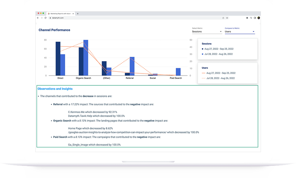
Step 4 – Add the written analysis layer. Manually, this means reviewing the campaign table, identifying the driver of any change, and writing a short narrative. Automated tools like DataMyth generate this analysis automatically, identifying which campaign or ad set caused the shift and ranking the causes by degree of impact. See the Facebook Ads Report page for how this works in practice.

Step 5 – Schedule delivery. Set the report to generate and deliver monthly (weekly for active testing phases). The client should receive it without you manually triggering anything.

How Often Should a Facebook Ads Dashboard Be Updated?

Update your Facebook Ads reporting dashboard live (daily or real-time) for internal monitoring, and send the formal report monthly for stakeholder communication. The distinction matters: a live dashboard helps your team catch creative fatigue or budget pacing issues in real time. The monthly report is the strategic communication to the client, it requires written analysis and a recommendation, not just refreshed numbers.

For agencies running heavy A/B testing, a weekly report cadence makes sense during active test periods, dropping back to monthly once creative strategy is settled.

How Do Agencies Automate Facebook Ads Reporting?

Agencies automate Facebook Ads reporting by connecting their ad accounts once to a reporting platform, configuring a template that matches their reporting structure, and scheduling the report to generate automatically.

The platforms that do this well handle three things: automatic data pull from Meta, consistent report formatting, and written analysis of performance changes. The third is the differentiator, most tools automate the pull and formatting but leave the analysis to the account manager. DataMyth automates all three, including the narrative explaining what changed and why. Explore the DataMyth features or the Facebook Ads report template.
Categories
Uncategorized

LinkedIn Ads Reporting for Agencies: The B2B Metrics That Prove Value

LinkedIn Ads operate differently from every other paid channel, higher CPCs, longer sales cycles, and a buyer audience that demands a different measurement framework. LinkedIn Ads reporting that copies a Facebook Ads template will miss the metrics that actually matter for B2B, and send exactly the wrong signals to clients who expect qualified pipeline, not cheap clicks.

This guide covers the specific metrics that belong in a LinkedIn Ads report, how to structure reporting for non-marketing stakeholders, and how to automate the process so reporting week stops consuming your team.

What Does Effective LinkedIn Ads Reporting Measure?

Effective LinkedIn Ads reporting measures lead quality and pipeline contribution, not just traffic and impressions. LinkedIn CPCs average $5–$7, roughly 5–6x higher than Google Display, which means efficiency metrics like cost-per-click carry far less meaning than cost-per-lead and lead-to-opportunity rate. A report that leads with impressions and CTR is technically accurate but strategically useless for a B2B client who needs to justify a $15,000 monthly LinkedIn budget.

The metrics that belong in every LinkedIn Ads report:

MetricWhat It MeasuresWhy It Matters for B2B
Cost per Lead (CPL)Efficiency of lead generationCore B2B success metric
Lead VolumeTotal leads generatedBaseline output
Lead Form Completion RateQuality of the form experienceLow rate = friction in funnel
Click-Through Rate (CTR)Creative and audience resonanceIndicates message-market fit
Cost per Click (CPC)Bid efficiencyContext for CPL, not headline
Impressions & ReachBrand awareness reachSupporting context only
FrequencyHow often same person sees adGuards against audience fatigue
Conversion Rate (post-click)Lead page effectivenessDiagnoses landing page issues
Pipeline Influenced (if CRM connected)Revenue attributionUltimate B2B proof of value

How Should Agencies Structure a LinkedIn Ads Report for Non-Marketing Clients?

Structure a LinkedIn Ads report for non-marketing stakeholders by leading with business outcomes, leads and pipeline, before any platform metrics. Non-marketing decision-makers, a VP of Sales, a CFO, a CEO, do not care what your CPM was. They care whether LinkedIn produced conversations with the right people.

A proven structure for LinkedIn agency reports:

1. Executive summary (half page): Total spend, total leads, CPL, and one sentence on trend vs. prior period.

2. Lead quality section: Breakdown by job title, seniority, and company size if you’re using LinkedIn’s demographic filters. This is the uniquely valuable data LinkedIn provides that Google and Meta cannot — company-level targeting insight.

3. Campaign performance table: Campaigns ranked by CPL, with budget, impressions, clicks, leads, and spend per lead.

4. Creative performance: Top and bottom ad by CTR and conversion rate. One clear recommendation on which creative to scale or pause.

5. Written analysis: What changed from last period and the most likely reason, ranked by impact. This is the section that takes the longest to write manually, and the section that demonstrates your agency’s strategic value.

6. Recommendation: One or two concrete actions for next period.

Why LinkedIn Audience Demographics Make It Unique for Reporting

LinkedIn is the only paid channel that lets you report on who saw your ad at a professional level. Company name, job function, seniority, industry, and company size are all available in Campaign Manager’s demographic breakdowns. This data belongs in your LinkedIn Ads reporting because it answers the question clients actually care about: “Are we reaching the right people?”

If a campaign targeting VP-level finance decision-makers at companies over 1,000 employees is generating leads but the demographic report shows 60% of leads came from individual contributors at 50-person startups, the leads are misqualified, and the campaign strategy needs to change. No other ad platform surfaces this diagnosis as clearly.

Include a demographic breakdown table every reporting period and annotate any audience drift. This practice, consistently applied, is what separates a data-delivery agency from a strategic partner.

What Should a LinkedIn Ads Dashboard Include?

A LinkedIn Ads dashboard for real-time monitoring should include: live CPL, lead volume vs. target, spend pacing (daily burn rate vs. budget), frequency by campaign, and a creative performance summary. Keep it to six or seven tiles maximum.

Daily monitoring focuses on spend pacing and frequency. Weekly, check CPL trends and creative fatigue signals (frequency above 3–4 typically depresses CTR). Monthly, the full report goes out with demographic breakdown and written analysis.

The dashboard and the report serve different purposes. The dashboard tells you whether anything needs an immediate intervention. The report tells the client what the month meant and what to do next.

How Do You Automate LinkedIn Ads Reporting?

Automate LinkedIn Ads reporting by connecting your Campaign Manager account to a reporting platform that pulls data automatically, applies a consistent template, and generates the written analysis of what changed and why.

DataMyth connects to LinkedIn Ads and generates the full written analysis, including the performance narrative and impact ranking, automatically, so the report is ready to send without your team spending hours in spreadsheets. See how the LinkedIn Ads Report works.

The practical automation checklist:

  • Connect Campaign Manager once (OAuth, no manual exports)
  • Set a reporting template that matches your client’s audience (business-outcome-first)
  • Schedule monthly delivery with automated written analysis
  • Reserve your team’s time for the demographic review and strategic recommendation, the parts that require human judgment

What metrics should a LinkedIn Ads report include?

A LinkedIn Ads report should lead with cost per lead, lead volume, and lead form completion rate. Support these with CTR, CPC, and frequency. Include a demographic breakdown (job title, seniority, company size) and a written analysis of what changed compared to the prior period.

How is LinkedIn Ads reporting different from Facebook Ads reporting?

LinkedIn Ads reporting prioritizes lead quality and B2B demographic targeting data over volume metrics like impressions and reach. LinkedIn CPCs are significantly higher, so the efficiency metric that matters is cost per qualified lead, not cost per click. Facebook reporting focuses more on ROAS, frequency, and creative testing at scale.

What is a LinkedIn Ads reporting tool?

A LinkedIn Ads reporting tool connects to Campaign Manager, pulls performance data automatically, and generates formatted reports, ideally with written analysis of what drove changes. DataMyth is one such tool, providing automated LinkedIn Ads reports with performance insights built in.

How often should agencies send LinkedIn Ads reports?

Most B2B agencies send LinkedIn Ads reports monthly, with a lighter weekly check-in during active campaign testing. Monthly is the right cadence for stakeholder reporting because LinkedIn’s longer sales cycles mean weekly data often lacks enough signal to act on.

Can you automate a LinkedIn Ads report?

Yes. Connect your LinkedIn Ads account to a marketing reporting platform, set your template and schedule, and the report generates automatically each period. The automated analysis, explaining what changed and why, is what separates useful automated reports from plain data exports.

What demographic data can I include in a LinkedIn Ads report?

LinkedIn Campaign Manager provides demographic breakdowns by job title, job function, seniority level, company name, company size, industry, and location. Including a demographic section in your report is what distinguishes LinkedIn reporting from other channels, it answers whether you reached the right people, not just whether people clicked.f

Categories
Uncategorized

White-Label Marketing Reports: A Guide for Agencies

The report you send a client is not just data, it is a touchpoint with your brand. When it arrives covered in another tool’s logo, you are advertising your vendor instead of yourself, and you are quietly telling the client you are a reseller rather than the expert. White-label marketing reports fix that, letting every report you deliver look like it came from your agency and no one else. Here is why that matters and how to do it well.

Why white-labeling matters more than it seems

At first glance, white-labeling looks cosmetic, just swapping a logo. But client relationships are built on perceived expertise, and every branded touchpoint reinforces or undermines that perception. A report carrying a third-party tool’s branding subtly signals that the insight came from software, not from you. A report carrying your agency’s brand signals the opposite: that this analysis is your work, your expertise, your value.

For agency reporting, that perception directly affects retention and pricing. Clients pay for expertise they trust, and consistent branding is one of the quiet ways trust accumulates. White-labeling is not vanity; it is positioning.

Look bigger than you are

For small and growing agencies, white-label marketing reports offer a second advantage: they let you present at a scale beyond your headcount. A two-person agency delivering polished, fully branded reports looks every bit as established as a twenty-person shop. The client does not see the tools behind the curtain; they see a professional operation that produces professional deliverables.

This matters most when you are competing for larger clients who expect a certain level of polish. Branded client reports signal that you take the relationship seriously and have the systems to support it, closing the credibility gap that small agencies otherwise face against bigger competitors.

What good white-labeling includes

Effective white-labeling goes beyond dropping your logo in a corner. The elements that make a report feel genuinely yours:

  • Your logo, prominently placed, so the report is unmistakably from your agency.
  • The client’s logo and name, personalizing each report and showing the client you built it for them specifically.
  • Consistent branding across every report, so a client who works with you for years sees the same professional identity each time.
  • Clean, uncluttered presentation that reflects the quality of your work rather than the defaults of a tool.

A good white-label reporting tool makes all of this fast to apply, so branding is a setup step rather than a per-report chore.

The time problem white-labeling must solve

Here is the catch that trips up many agencies. Custom-branding every report by hand, exporting data, dropping in logos, formatting, adding the client’s name, is exactly the kind of manual work that eats an agency’s hours. As per the survey DataMyth conducted, marketers spend around 7.5 hours a week building reports with analysis. If white-labeling adds friction to that, it becomes a burden rather than a benefit.

The solution is automation. The right approach lets you set your branding and the client’s details once, then generate branded reports on demand without rebuilding the presentation every cycle. With DataMyth, you can add each client’s logo and name, update it at any time, and produce branded reports with data, graphs, and written analysis in minutes rather than hours. White-labeling stops being extra work and becomes a default state.

Consistency across a client roster

For agencies managing many clients, agency client reporting at scale introduces a consistency challenge. Each client needs their own branding, their own metrics, their own cadence, and doing that manually across a full roster is where reporting quality slips under pressure. Reports get rushed, branding gets inconsistent, and the polish that white-labeling promised erodes.

Automating branded, per-client reports keeps quality consistent no matter how many clients you serve. Every client gets a report that looks purpose-built for them, whether you have five clients or fifty, without the reporting workload scaling linearly with your roster. That consistency is what lets an agency grow without its reporting falling apart.

Branding is only half the value

It is worth remembering that a beautifully branded report is still only as valuable as what it says. White-label marketing reports that look professional but contain only raw charts still leave the client to interpret the data themselves. The strongest reports pair your branding with genuine insight, the written analysis of what changed and why, so the client gets both a report that looks like your expertise and content that proves it.

That combination, your brand plus real explanation, is what makes reporting a retention tool rather than a formality. The branding earns the first impression; the insight earns the renewal.

Make every report work for you

Every report you send is a chance to reinforce your agency’s value or to dilute it. White-label marketing reports ensure each one reinforces it, presenting your work under your brand, personalized for each client, and delivered without the manual burden that makes branding feel like a chore. Set your branding once, automate the delivery, pair it with real insight, and let every report you send quietly build the case for keeping you.

What are white-label marketing reports?

They are client reports branded entirely as your agency’s own, carrying your logo and identity rather than a third-party tool’s. They let you present marketing data as your expertise instead of advertising the software behind it.

Why should an agency use white-label reports?

Branded reports build client trust, reinforce your expertise, and let small agencies look as established as larger ones. Consistent branding across every report supports retention and helps justify your pricing.

Does white-labeling reports take a lot of extra time?

It shouldn’t. With an automated reporting tool, you set your branding and each client’s details once, then generate branded reports in minutes, so white-labeling becomes a default state rather than a manual per-report task.

Is branding enough to make a report valuable?

No. Branding earns the first impression, but the report still needs real insight. The strongest white-label reports pair your branding with written analysis of what changed and why, so the report proves your value as well as displaying your name.

Categories
Uncategorized

Google Ads Reporting for Non-Technical Clients

Your Google Ads account is a dashboard of impressions, CTR, CPC, quality scores, and conversion columns that make perfect sense to you and none to your client. The gap between what you understand and what they understand is where trust either builds or breaks. Good Google Ads reporting for non-technical clients is not about showing everything you know; it is about translating performance into terms a business owner actually cares about. Here is how to bridge that gap.

Remember what the client is really asking

Behind every reporting relationship is one unspoken question from the client: is this money working? They are not asking about quality score or impression share. They are asking whether the budget they hand you is producing results they can feel, leads, sales, growth. Every choice in your Google Ads reporting should serve that question.

When you lead with metrics that answer it, the client relaxes. When you lead with jargon, they tense up, even if the numbers are good, because they cannot tell whether the numbers are good. Clarity is what builds confidence.

Lead with outcomes, not activity

The most common mistake in reporting to non-technical clients is opening with activity metrics, impressions, clicks, CTR, before getting to outcomes. Those are the numbers that matter to you as the operator, but to the client they are means, not ends. Flip the order.

Start every report with the outcomes: how many leads or sales the campaign produced, what each one cost, and how that compares to before. Then, only if useful, explain the activity metrics that drove those outcomes. Leading with results tells the client immediately whether their money worked, and everything after that becomes supporting detail rather than confusing preamble. A strong campaign performance report answers the value question in its first few lines.

Translate the jargon

When you do need to reference technical metrics, translate them. Every PPC term has a plain-language equivalent that a business owner grasps instantly:

  • Impressions become “how many times your ad was seen.”
  • CTR becomes “how often people who saw the ad clicked it.”
  • CPC becomes “what you paid for each visit to your site.”
  • Conversion rate becomes “how often those visits turned into leads.”
  • CPA becomes “what each lead or sale cost you.”

Building this translation into your PPC report does two things. It makes the report readable, and it subtly educates the client, so over time they become better partners who understand what you are optimizing toward.

Show the trend, not just the snapshot

A single period’s numbers mean little to a client with no baseline. Is a $40 cost per lead good? They have no idea unless you show them last month was $55. Context turns a number into a story, and trends are the clearest context you can give.

Always frame Google Ads reporting against a comparison: this period versus last, or against the target you agreed on. A client who sees cost per lead falling and conversions rising understands progress even if they never learn what CPA stands for. The direction of travel communicates far more than any single figure.

Explain the why, not just the what

This is where most reports fall short and where trust is genuinely won or lost. A client who sees leads dropped does not want a chart; they want to know why, and what you are doing about it. A report that shows a decline without explanation reads as a problem you have not noticed. The same decline, paired with “leads dipped because a competitor raised bids on our top keyword, so we shifted budget to a better-performing campaign,” reads as a professional in control.

Providing that ad spend explanation in plain writing is the difference between a client who worries and a client who trusts. This is precisely the work that automated analysis can carry: DataMyth generates the written explanation of what changed in the account and the likely reason based on the degree of impact, so every report arrives with the why already attached rather than leaving the account manager to write it from scratch.

Keep it short and scannable

Non-technical clients do not read long reports; they skim them. A twelve-page PDF of every metric signals thoroughness to you and overwhelm to them. Give them a short report that answers the value question up front, shows the trend, explains the why, and stops. If they want more detail, they will ask.

Respecting the client’s time is itself a form of communication. A tight, clear report says you understand what matters. A sprawling one says you are showing your work rather than serving their needs.

Reporting is a relationship

The best Google Ads reporting for non-technical clients is not a data exercise, it is a communication one. Lead with outcomes, translate the jargon, show the trend, and always explain the why. Do that consistently and reports stop being a monthly chore that raises questions and start being the thing that keeps clients confident, retained, and referring you to others. In client work, a report the client actually understands is worth more than a dozen they do not.

How do I explain Google Ads results to a non-technical client?

Lead with outcomes, leads and sales and their cost, before any activity metrics. Translate technical terms into plain language, show trends against a comparison, and always explain why performance changed, not just that it did.

Which Google Ads metrics matter most to clients?

Clients care about outcomes: how many leads or sales the campaign produced, what each cost (CPA), and how that compares to previous periods or targets. Activity metrics like impressions and CTR are supporting detail, not the headline.

How long should a Google Ads report be?

Short and scannable. Non-technical clients skim, so answer the value question up front, show the trend, explain the why, and stop. Offer deeper detail only if the client asks for it.

How do I explain a drop in performance without losing the client?

Pair the decline with a clear reason and your response, for example a competitor raising bids and how you reallocated budget. An explained dip reads as control; an unexplained one reads as a problem you missed.

Categories
Uncategorized

GA4 Metrics Every Marketing Report Needs in 2026

Google Analytics 4 gives you more data than any client will ever read, which is exactly the problem. Dump every available number into a report and you bury the story. The skill is not access to data; it is knowing which GA4 metrics actually explain performance and which are just noise. Here are the metrics that belong in every marketing report, organized around the questions a client genuinely wants answered.

Start with the question, not the metric

Before listing metrics, it helps to frame why they matter. A good report answers three questions: How many people came? What did they do? Did they convert? These map to the classic acquisition, behavior, and conversion structure that GA4 is built around. Every metric you include should serve one of those three questions, and anything that does not is a candidate for cutting.

Organizing your GA4 metrics this way keeps reports focused. Instead of a wall of numbers, the client sees a clear narrative: here is your traffic, here is what it did, here is what it earned you.

Acquisition: how people found you

The acquisition section answers where your traffic came from and whether the mix is healthy. The core metrics here:

  • Users and new users. The count of people who visited and how many were first-timers. This is the top-line reach figure most clients look for first.
  • Sessions. The number of visits, which alongside users tells you how often people return.
  • Traffic by channel. The breakdown across organic, paid, direct, referral, and social. This is often the most revealing acquisition view, because it shows which efforts are actually driving people to the site.
  • Sessions by source or medium. A deeper cut when a client wants to know which specific campaigns or referrers are working.

Among GA4 KPIs, the channel breakdown is the one that usually sparks the most useful conversation, because it ties traffic directly to the marketing activities the client is paying for.

Behavior: what people did

Once people arrive, behavior metrics reveal whether the site actually engages them. GA4 reframed this area around engagement rather than the old bounce rate, and the modern metrics are more useful for it:

  • Engagement rate. The share of sessions that were meaningfully engaged, a far more honest signal than bounce rate ever was.
  • Average engagement time. How long users actively spent on the site, indicating whether content holds attention.
  • Engaged sessions per user. Whether people come back and stay engaged, a sign of content and audience fit.
  • Views by page. Which pages draw and hold attention, showing what content is doing the work.

These website performance metrics answer the middle question, whether the traffic you acquired found what it needed, which is where many reports go silent and shouldn’t.

Conversion: what it earned

The conversion section is where the client sees value, and it is the section that justifies the marketing spend. The essential metrics:

  • Key events and conversions. The specific actions that matter, sign-ups, purchases, form fills, leads, tracked as GA4 key events.
  • Conversion rate. The share of sessions or users that completed a key action, the single number that best summarizes effectiveness.
  • Conversions by channel. Which traffic sources actually convert, not just which drive volume. A channel with heavy traffic but few conversions is very different from one with modest traffic and strong conversions.
  • Revenue or value, where ecommerce or value tracking is set up, tying activity to money.

This is the part of Google Analytics 4 reporting clients care about most, because it connects the marketing work to outcomes they can feel.

The metrics to leave out

Just as important as what to include is what to cut. Reports drown in metrics that feel informative but rarely change a decision. Raw pageview totals without context, obscure technical dimensions, and any metric no one can act on all add length without adding insight. If a number would not change what the client does next, it probably does not belong in the report.

Restraint is a feature. A tight report that answers the three core questions clearly beats an exhaustive one that answers none of them.

From metrics to meaning

Here is the part most reports miss entirely. A list of GA4 metrics, however well chosen, is still just numbers until someone explains what changed and why. A client seeing that conversions dropped 12% does not want to hunt for the cause; they want to be told the drop came from a fall in paid traffic after a budget change, for example.

This is where automated analysis earns its place. DataMyth takes your selected GA4 metrics, structures them around the acquisition, behavior, and conversion model, and generates the written explanation of what moved and why, identifying the change and its likely cause based on the degree of impact. The report stops being a data dump and becomes something the client can read and act on in minutes.

Build the report around the reader

The best client reporting starts from what the reader needs to know, not from what the tool can display. Choose the GA4 metrics that answer the three questions, cut the ones that do not, and pair the numbers with a plain-language explanation of what they mean. Do that, and your reports go from something clients skim to something they rely on, which is the whole point of reporting in the first place.

Categories
Uncategorized

DataMyth vs DashThis -Comparing Automated Reporting Tools

DashThis has long been a go-to for agencies wanting quick, no-code dashboards, but its simplicity can be a double-edged sword once client rosters grow. This comparison looks at where DashThis holds up, where agencies start looking elsewhere, and how DataMyth handles the same reporting challenge.

DashThis’s Core Strength

DashThis is built around fast dashboard creation with minimal setup, letting agencies connect a data source and get a report live in minutes. It’s a popular pick for smaller teams that want simplicity over deep customization.

Common Friction Points

  • Dashboards are largely template-based, offering limited room for deep customization of layout or branding depth.
  • Like most dashboard-first tools, written interpretation of “why” a metric moved is left to the user.
  • As agencies add more clients and data sources, per-report costs can climb.

How DataMyth Approaches It Differently

Instead of just consolidating metrics into a dashboard, DataMyth automatically writes the analysis behind performance shifts, reducing the manual commentary that account managers add on top of a DashThis-style report. This becomes especially useful for agencies managing many accounts weekly, where writing individual insights per client eats significant time.

Choosing Between the Two

  • DashThis suits teams prioritizing speed and simplicity in dashboard setup.
  • DataMyth suits teams that want the report to explain itself without added manual write-ups.
  • Run a trial period with both before migrating existing client reports.

Conclusion

Both tools automate the mechanical side of reporting, but the real differentiator is whether your team still needs to write the story behind the data. If that’s your biggest time cost, DataMyth’s automated insight layer closes that gap directly.

Is DashThis good for small agencies?

Yes, it’s designed for fast setup and works well for small teams needing straightforward dashboards without heavy customization.

Does DataMyth offer a free trial like DashThis?

Yes, DataMyth offers a 7-day free trial with no credit card required, letting you test automated insights before committing.

Which tool saves more time on reporting?

DashThis saves time on dashboard building; DataMyth saves additional time by automating the written performance analysis on top of the data.

Can both tools connect to Google Ads and Meta Ads?

Yes, both platforms support integrations with major ad and analytics platforms including Google Ads and Meta Ads.

Categories
Uncategorized

Digital Marketing KPIs Every Agency Should Track (And How to Automate Them)

Every agency tracks metrics, but not every agency tracks the right ones, or explains them clearly enough for a client to act on. This guide breaks down the core digital marketing KPIs worth prioritizing and how automating their reporting saves hours every month.

The Core KPIs Most Agencies Should Track

  • Cost per acquisition (CPA), tracks efficiency of paid spend across Google Ads and Meta Ads campaigns.
  • Click-through rate (CTR), signals ad relevance and creative performance.
  • Return on ad spend (ROAS), ties spend directly to revenue outcomes.
  • Conversion rate, measures how well traffic turns into leads or sales.
  • Organic search visibility, tracked through Google Analytics and Search Console reporting.

Why KPI Selection Matters More Than KPI Volume

Agencies often over-report, cramming dozens of metrics into a single client dashboard, which dilutes focus rather than sharpening it. A smaller set of well-chosen digital marketing KPIs, tied directly to client goals, tends to produce clearer client conversations than an exhaustive metrics dump.

The Manual Reporting Problem

Pulling KPIs from multiple platforms, Google Ads, Meta Ads, LinkedIn Ads, GA4, manually every reporting cycle is repetitive and time-consuming, and it’s exactly the kind of task most prone to human error under deadline pressure.

Automating KPI Tracking and Analysis

Modern reporting platforms connect directly to ad and analytics platforms, pulling KPI data automatically instead of requiring manual exports. DataMyth goes further by pairing each KPI with a written explanation of what drove any change, turning a static KPI table into a report clients can interpret without a follow-up call.

Conclusion

The right digital marketing KPIs, tracked consistently and explained clearly, do more for client retention than a longer metrics list ever will. Automating both the collection and the interpretation of these KPIs is what turns raw numbers into insights clients actually act on.