On an average, a digital marketer spends 7.5 hours in a week (based on a survey conducted by DataMyth) creating and analyzing reports across channels for clients/stakeholders. These reports generally are a combination of customized reports based on the client’s requirements or report templates which cover all the necessary information about your website performance in terms of traffic, goals, user behaviour, etc. Google Analytics provides a lot of data but not all of it gets in the weekly or monthly reports. In this blog we will cover the sections which we think are critical and mandatory for a client/stakeholder to understand the website performance.
This report structure will help answer the following:
- The number of users received for the selected date range
- The source of users by channel
- Top channels by user
- Campaigns/pages that drove the most sessions
- Top landing pages in terms of sessions
- Pages that people spend the most time on
- Time spent by users on the site
- Devices used by users to view the site
- Countries users visit from
1. An Overview Section:
The report should always start with an overview of the performance of your website for the selected date range. This section will give the reader information about the overall performance in the first few minutes. The synopsis should cover the ABC of Google Analytics reporting – Acquisition, Behaviour & Conversion.
- Acquisition helps you understand the number of users and where the traffic is coming from. For example: Users, Sessions, Source, etc.
- Behaviour contains data which helps you understand what users do on your website such as Pages/Session, Avg. Time Spent & Bounce Rate
- Conversion data maps your Goals, Goal Rate & Goal Value
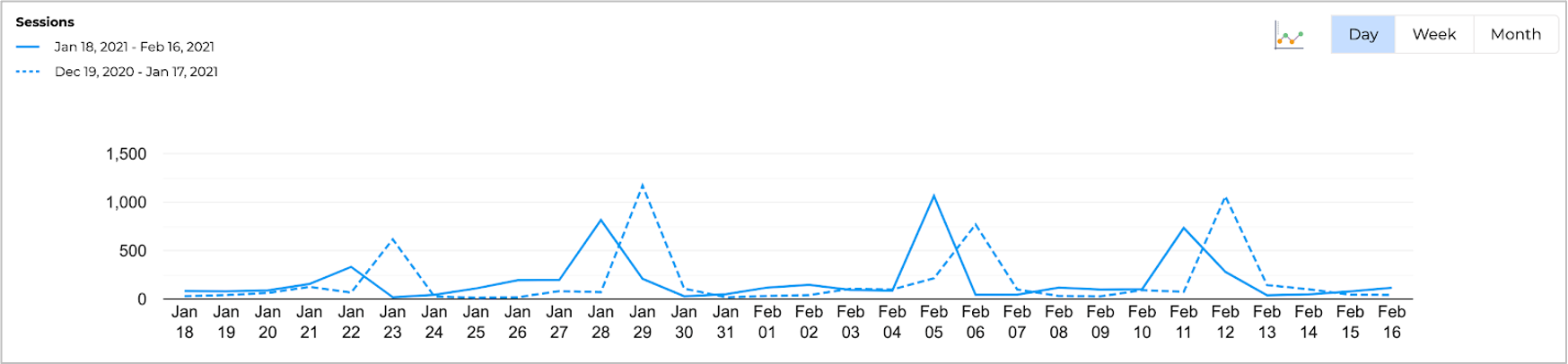
Along with the data table, adding graphs makes it more visually appealing and increases the ease of understanding. You can either show the trend for the selected period or for the last 6 months.
Always ensure to add insights that not only identifies the increase or decrease, but also defines the reason for the change in performance
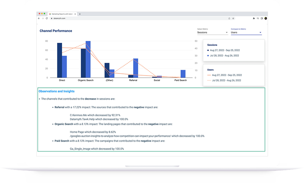
2. Source of Users by Channel :
While the overview section provides a summary of the performance, the Channel performance section maps your traffic by different sources such as Email, Organic, Paid, Social, etc. An easy representation of performance by channel helps understand which channel is doing better compared to the others.
Now that the data is displayed, one of the important elements to include is the analysis of how the performance was impacted by each channel for the selected period (single date range or comparison date range). Showing a percentage increase and decrease is not a clear indicator of your website’s performance since a change in a channel goal from 1 to 2 is a 100% increase. So ensure that your data is calculated taking the impact of each parameter into consideration, and not the percentage difference. Once the channel is identified, next, find the pages/campaigns that triggered the impact for the respective channel.
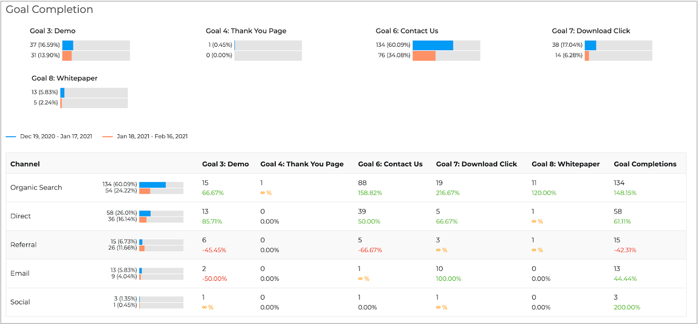
3. Goal Completion
Based on the goals set for each channel which is inline with your objective, Google analytics provides data for each of the goal types across channels. While this is very helpful you will not receive a consolidated view of all the goals created. So showcasing goals by type & channel gives a clear picture of your goal performance.
Considering the goals set, identify what’s working and what’s not by channel source. Just like we discussed in the channel performance section, calculate the impact here as well instead of the absolute difference. If you are an eCommerce brand, you will have a clear understanding of your ROI by channel. You can optimize your marketing efforts building on this information.
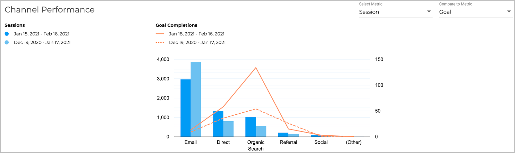
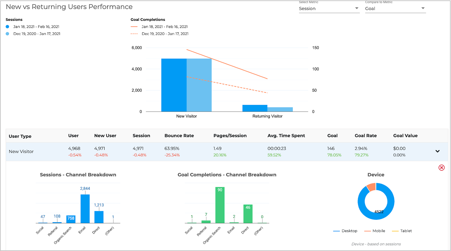
4. New vs Returning Users Performance
It is very important to understand your website user type (new or returning). If you are an eCommerce, media or entertainment client, you should have a good balance between new and returning users. If your brand is focused on B2B, it is better to have more new users than returning users. Providing a breakup of channel & device for traffic & goal will give additional information about your marketing efforts and their results.
For example, the image in this section shows that even though Email drives the highest number of sessions, it does not result in goal conversions for new users, whereas Organic Search goal conversions are higher than Email campaigns. Based on your industry & data, you can make changes to your marketing efforts accordingly.
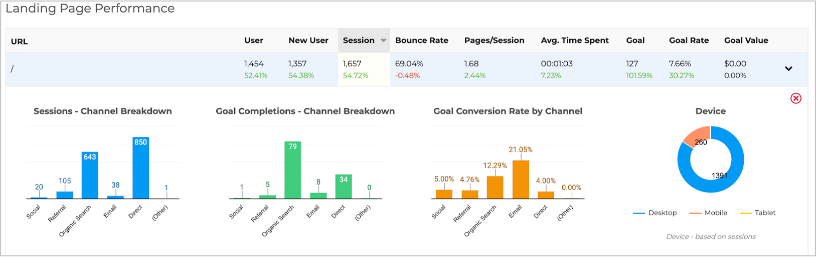
5. Identifying the Top Landing Pages
Google Analytics provides landing page reports with traffic, behaviour and conversion details but what matters most is to answer a few questions like:
a) why did the traffic increase/decrease?
b) why is the bounce rate for the page high?
c) which pages do users spend most time on?
To get answers to these questions, we should drill down further into the data. Check the source, device & user type for the page which generated the highest sessions, or low bounce rates , whichever your key metric is. Based on the data available, optimize the page to improve the performance.
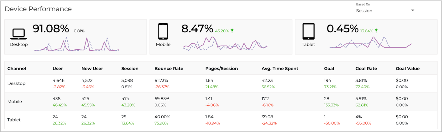
6. Device Performance
Understanding the device your audience uses helps you optimize your campaign targets, website speed and responsiveness. Along with the overall device data, knowing the channel source for each device can help define the marketing efforts for the respective channel.
7. Location Performance
Location is a very simple yet important element for your analysis. It shows where you are getting your majority of traffic or goal conversions. Based on this data you can target locations for campaigns or allocate more budget.

Apart from these there are other reports like
- Hourly report to understand at what time of the day you are driving sessions or goal conversions
- Page Navigation Report to understand how the user navigates through your website. Are they getting all the information needed or they abandon the page due to lack of information, bad user experience, it is not optimized for a device & etc.
All the sections covered are present in the Google Analytics console, and each section is a different report that needs to be combined. DataMyth is a solution that can build the report within seconds with data, graphs and analysis – All you need to do is use the time saved to define your strategy. Visit the Google Analytics Report page for more details.