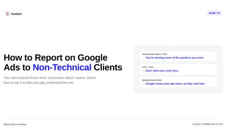
Google Ads Reporting for Non-Technical Clients

Your Google Ads account is a dashboard of impressions, CTR, CPC, quality scores, and conversion columns that make perfect sense to you and none to your client. The gap between what you understand and what they understand is where trust either builds or breaks. Good Google Ads reporting for non-technical clients is not about showing everything you know; it is about translating performance into terms a business owner actually cares about. Here is how to bridge that gap.

Remember what the client is really asking

Behind every reporting relationship is one unspoken question from the client: is this money working? They are not asking about quality score or impression share. They are asking whether the budget they hand you is producing results they can feel, leads, sales, growth. Every choice in your Google Ads reporting should serve that question.

When you lead with metrics that answer it, the client relaxes. When you lead with jargon, they tense up, even if the numbers are good, because they cannot tell whether the numbers are good. Clarity is what builds confidence.

Lead with outcomes, not activity

The most common mistake in reporting to non-technical clients is opening with activity metrics, impressions, clicks, CTR, before getting to outcomes. Those are the numbers that matter to you as the operator, but to the client they are means, not ends. Flip the order.

Start every report with the outcomes: how many leads or sales the campaign produced, what each one cost, and how that compares to before. Then, only if useful, explain the activity metrics that drove those outcomes. Leading with results tells the client immediately whether their money worked, and everything after that becomes supporting detail rather than confusing preamble. A strong campaign performance report answers the value question in its first few lines.

Translate the jargon

When you do need to reference technical metrics, translate them. Every PPC term has a plain-language equivalent that a business owner grasps instantly:

  • Impressions become “how many times your ad was seen.”
  • CTR becomes “how often people who saw the ad clicked it.”
  • CPC becomes “what you paid for each visit to your site.”
  • Conversion rate becomes “how often those visits turned into leads.”
  • CPA becomes “what each lead or sale cost you.”

Building this translation into your PPC report does two things. It makes the report readable, and it subtly educates the client, so over time they become better partners who understand what you are optimizing toward.

Show the trend, not just the snapshot

A single period’s numbers mean little to a client with no baseline. Is a $40 cost per lead good? They have no idea unless you show them last month was $55. Context turns a number into a story, and trends are the clearest context you can give.

Always frame Google Ads reporting against a comparison: this period versus last, or against the target you agreed on. A client who sees cost per lead falling and conversions rising understands progress even if they never learn what CPA stands for. The direction of travel communicates far more than any single figure.

Explain the why, not just the what

This is where most reports fall short and where trust is genuinely won or lost. A client who sees leads dropped does not want a chart; they want to know why, and what you are doing about it. A report that shows a decline without explanation reads as a problem you have not noticed. The same decline, paired with “leads dipped because a competitor raised bids on our top keyword, so we shifted budget to a better-performing campaign,” reads as a professional in control.

Providing that ad spend explanation in plain writing is the difference between a client who worries and a client who trusts. This is precisely the work that automated analysis can carry: DataMyth generates the written explanation of what changed in the account and the likely reason based on the degree of impact, so every report arrives with the why already attached rather than leaving the account manager to write it from scratch.

Keep it short and scannable

Non-technical clients do not read long reports; they skim them. A twelve-page PDF of every metric signals thoroughness to you and overwhelm to them. Give them a short report that answers the value question up front, shows the trend, explains the why, and stops. If they want more detail, they will ask.

Respecting the client’s time is itself a form of communication. A tight, clear report says you understand what matters. A sprawling one says you are showing your work rather than serving their needs.

Reporting is a relationship

The best Google Ads reporting for non-technical clients is not a data exercise, it is a communication one. Lead with outcomes, translate the jargon, show the trend, and always explain the why. Do that consistently and reports stop being a monthly chore that raises questions and start being the thing that keeps clients confident, retained, and referring you to others. In client work, a report the client actually understands is worth more than a dozen they do not.

How do I explain Google Ads results to a non-technical client?

Lead with outcomes, leads and sales and their cost, before any activity metrics. Translate technical terms into plain language, show trends against a comparison, and always explain why performance changed, not just that it did.

Which Google Ads metrics matter most to clients?

Clients care about outcomes: how many leads or sales the campaign produced, what each cost (CPA), and how that compares to previous periods or targets. Activity metrics like impressions and CTR are supporting detail, not the headline.

How long should a Google Ads report be?

Short and scannable. Non-technical clients skim, so answer the value question up front, show the trend, explain the why, and stop. Offer deeper detail only if the client asks for it.

How do I explain a drop in performance without losing the client?

Pair the decline with a clear reason and your response, for example a competitor raising bids and how you reallocated budget. An explained dip reads as control; an unexplained one reads as a problem you missed.
GA4 Metrics Every Marketing Report Needs in 2026

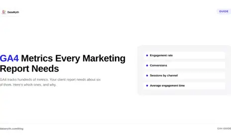
Google Analytics 4 gives you more data than any client will ever read, which is exactly the problem. Dump every available number into a report and you bury the story. The skill is not access to data; it is knowing which GA4 metrics actually explain performance and which are just noise. Here are the metrics that belong in every marketing report, organized around the questions a client genuinely wants answered.

Start with the question, not the metric

Before listing metrics, it helps to frame why they matter. A good report answers three questions: How many people came? What did they do? Did they convert? These map to the classic acquisition, behavior, and conversion structure that GA4 is built around. Every metric you include should serve one of those three questions, and anything that does not is a candidate for cutting.

Organizing your GA4 metrics this way keeps reports focused. Instead of a wall of numbers, the client sees a clear narrative: here is your traffic, here is what it did, here is what it earned you.

Acquisition: how people found you

The acquisition section answers where your traffic came from and whether the mix is healthy. The core metrics here:

  • Users and new users. The count of people who visited and how many were first-timers. This is the top-line reach figure most clients look for first.
  • Sessions. The number of visits, which alongside users tells you how often people return.
  • Traffic by channel. The breakdown across organic, paid, direct, referral, and social. This is often the most revealing acquisition view, because it shows which efforts are actually driving people to the site.
  • Sessions by source or medium. A deeper cut when a client wants to know which specific campaigns or referrers are working.

Among GA4 KPIs, the channel breakdown is the one that usually sparks the most useful conversation, because it ties traffic directly to the marketing activities the client is paying for.

Behavior: what people did

Once people arrive, behavior metrics reveal whether the site actually engages them. GA4 reframed this area around engagement rather than the old bounce rate, and the modern metrics are more useful for it:

  • Engagement rate. The share of sessions that were meaningfully engaged, a far more honest signal than bounce rate ever was.
  • Average engagement time. How long users actively spent on the site, indicating whether content holds attention.
  • Engaged sessions per user. Whether people come back and stay engaged, a sign of content and audience fit.
  • Views by page. Which pages draw and hold attention, showing what content is doing the work.

These website performance metrics answer the middle question, whether the traffic you acquired found what it needed, which is where many reports go silent and shouldn’t.

Conversion: what it earned

The conversion section is where the client sees value, and it is the section that justifies the marketing spend. The essential metrics:

  • Key events and conversions. The specific actions that matter, sign-ups, purchases, form fills, leads, tracked as GA4 key events.
  • Conversion rate. The share of sessions or users that completed a key action, the single number that best summarizes effectiveness.
  • Conversions by channel. Which traffic sources actually convert, not just which drive volume. A channel with heavy traffic but few conversions is very different from one with modest traffic and strong conversions.
  • Revenue or value, where ecommerce or value tracking is set up, tying activity to money.

This is the part of Google Analytics 4 reporting clients care about most, because it connects the marketing work to outcomes they can feel.

The metrics to leave out

Just as important as what to include is what to cut. Reports drown in metrics that feel informative but rarely change a decision. Raw pageview totals without context, obscure technical dimensions, and any metric no one can act on all add length without adding insight. If a number would not change what the client does next, it probably does not belong in the report.

Restraint is a feature. A tight report that answers the three core questions clearly beats an exhaustive one that answers none of them.

From metrics to meaning

Here is the part most reports miss entirely. A list of GA4 metrics, however well chosen, is still just numbers until someone explains what changed and why. A client seeing that conversions dropped 12% does not want to hunt for the cause; they want to be told the drop came from a fall in paid traffic after a budget change, for example.

This is where automated analysis earns its place. DataMyth takes your selected GA4 metrics, structures them around the acquisition, behavior, and conversion model, and generates the written explanation of what moved and why, identifying the change and its likely cause based on the degree of impact. The report stops being a data dump and becomes something the client can read and act on in minutes.

Build the report around the reader

The best client reporting starts from what the reader needs to know, not from what the tool can display. Choose the GA4 metrics that answer the three questions, cut the ones that do not, and pair the numbers with a plain-language explanation of what they mean. Do that, and your reports go from something clients skim to something they rely on, which is the whole point of reporting in the first place.

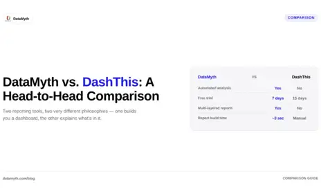
DataMyth vs DashThis -Comparing Automated Reporting Tools

DashThis has long been a go-to for agencies wanting quick, no-code dashboards, but its simplicity can be a double-edged sword once client rosters grow. This comparison looks at where DashThis holds up, where agencies start looking elsewhere, and how DataMyth handles the same reporting challenge.

DashThis’s Core Strength

DashThis is built around fast dashboard creation with minimal setup, letting agencies connect a data source and get a report live in minutes. It’s a popular pick for smaller teams that want simplicity over deep customization.

Common Friction Points

  • Dashboards are largely template-based, offering limited room for deep customization of layout or branding depth.
  • Like most dashboard-first tools, written interpretation of “why” a metric moved is left to the user.
  • As agencies add more clients and data sources, per-report costs can climb.

How DataMyth Approaches It Differently

Instead of just consolidating metrics into a dashboard, DataMyth automatically writes the analysis behind performance shifts, reducing the manual commentary that account managers add on top of a DashThis-style report. This becomes especially useful for agencies managing many accounts weekly, where writing individual insights per client eats significant time.

Choosing Between the Two

  • DashThis suits teams prioritizing speed and simplicity in dashboard setup.
  • DataMyth suits teams that want the report to explain itself without added manual write-ups.
  • Run a trial period with both before migrating existing client reports.

Conclusion

Both tools automate the mechanical side of reporting, but the real differentiator is whether your team still needs to write the story behind the data. If that’s your biggest time cost, DataMyth’s automated insight layer closes that gap directly.

Is DashThis good for small agencies?

Yes, it’s designed for fast setup and works well for small teams needing straightforward dashboards without heavy customization.

Does DataMyth offer a free trial like DashThis?

Yes, DataMyth offers a 7-day free trial with no credit card required, letting you test automated insights before committing.

Which tool saves more time on reporting?

DashThis saves time on dashboard building; DataMyth saves additional time by automating the written performance analysis on top of the data.

Can both tools connect to Google Ads and Meta Ads?

Yes, both platforms support integrations with major ad and analytics platforms including Google Ads and Meta Ads.

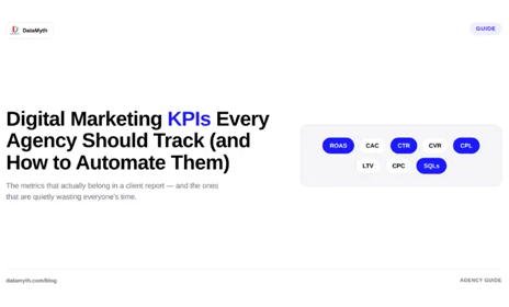
Digital Marketing KPIs Every Agency Should Track (And How to Automate Them)

Every agency tracks metrics, but not every agency tracks the right ones, or explains them clearly enough for a client to act on. This guide breaks down the core digital marketing KPIs worth prioritizing and how automating their reporting saves hours every month.

The Core KPIs Most Agencies Should Track

  • Cost per acquisition (CPA), tracks efficiency of paid spend across Google Ads and Meta Ads campaigns.
  • Click-through rate (CTR), signals ad relevance and creative performance.
  • Return on ad spend (ROAS), ties spend directly to revenue outcomes.
  • Conversion rate, measures how well traffic turns into leads or sales.
  • Organic search visibility, tracked through Google Analytics and Search Console reporting.

Why KPI Selection Matters More Than KPI Volume

Agencies often over-report, cramming dozens of metrics into a single client dashboard, which dilutes focus rather than sharpening it. A smaller set of well-chosen digital marketing KPIs, tied directly to client goals, tends to produce clearer client conversations than an exhaustive metrics dump.

The Manual Reporting Problem

Pulling KPIs from multiple platforms, Google Ads, Meta Ads, LinkedIn Ads, GA4, manually every reporting cycle is repetitive and time-consuming, and it’s exactly the kind of task most prone to human error under deadline pressure.

Automating KPI Tracking and Analysis

Modern reporting platforms connect directly to ad and analytics platforms, pulling KPI data automatically instead of requiring manual exports. DataMyth goes further by pairing each KPI with a written explanation of what drove any change, turning a static KPI table into a report clients can interpret without a follow-up call.

Conclusion

The right digital marketing KPIs, tracked consistently and explained clearly, do more for client retention than a longer metrics list ever will. Automating both the collection and the interpretation of these KPIs is what turns raw numbers into insights clients actually act on.

How to Build a High-Converting LinkedIn Ads Report Template (With 0 Manual Grunt Work)

If you are a digital marketer or agency owner, you already know that managing B2B campaigns is only half the battle; presenting the data clearly is the other. A structured LinkedIn ads report template is essential for translating complex B2B campaign metrics, such as lead generation costs, job title targeting performance, and account-based engagement, into actionable insights for stakeholders.

However, manually pulling data from Campaign Manager into spreadsheets drains an average of 7.5 hours a week. In this guide, we will explore what makes an effective LinkedIn ads report template, the critical KPIs to track, and how modern automation tools can generate comprehensive dashboards with written performance insights in just three seconds.

Why Every Agency Needs a Standardized LinkedIn Ads Report Template

When presenting performance metrics to executives or clients, raw data without context leads to confusion. A reliable LinkedIn ads report template establishes a consistent data storytelling framework. It allows you to move away from vanity metrics and focus on what drives ROI, such as cost per qualified lead (CPL), conversion rates across specific industries, and audience saturation.

Standardizing your reporting architecture ensures that stakeholders immediately recognize campaign wins, understand performance dips, and approve scaling strategies without requiring lengthy explanation meetings.

Key Components of a High-Performing LinkedIn Ads Dashboard

To build a LinkedIn ads dashboard that drives decision-making, your reporting layout must be structured into three logical tiers:

1. Executive Summary & Macro KPIs

Start your dashboard with high-level metrics that answer the immediate questions of C-level executives and clients:

  • Total Ad Spend vs. Budget Allocation
  • Total Impressions & Reach
  • Average Click-Through Rate (CTR)
  • Cost Per Lead (CPL) and Total Conversions

2. Audience & Demographic Breakdown

LinkedIn’s true power lies in its professional demographic targeting. Your reporting tool should visualize performance across:

  • Job Titles & Seniority Levels: Are decision-makers (e.g., VPs and C-Suite) clicking your ads, or is budget being absorbed by entry-level personnel?
  • Company Size & Industry: Identify which business sectors are generating the highest engagement rates.

3. Creative & Ad Format Performance

Break down how different ad formats, such as Sponsored Content, Document Ads, Lead Gen Forms, and Video Ads, are contributing to your funnel. Highlight top-performing creative assets and flag underperforming ad copy that requires immediate optimization or pause.

The Hidden Cost of Manual Spreadsheets vs. An Automated LinkedIn Ads Reporting Tool

While building a manual template in Excel or Looker Studio is a common starting point, it presents significant scalability issues. Data connectors frequently break, manual data entry introduces human error, and marketers spend hours writing commentary to explain why a metric changed.

Using a dedicated LinkedIn ads reporting tool like DataMyth eliminates manual assembly entirely. Instead of simply generating charts, DataMyth’s automated reporting engine analyzes your campaign performance, identifies KPIs with significant variance, and automatically writes clear, human-like performance commentary explaining the reasons behind the change.

How to Automate Your LinkedIn Reports in 3 Simple Steps

You can transition from manual data pulling to fully automated, white-labeled reporting in less than five minutes:

  • Connect Your Channels: Link your LinkedIn Campaign Manager account securely with a single click.
  • Select Your Client Account & Date Range: Choose the specific brand account and reporting timeframe (e.g., MoM, QoQ, or custom campaign dates).
  • Generate Instant Analysis: Watch as a comprehensive report complete with executive insights, demographic breakdowns, and impact analysis is generated in just three seconds.

By adopting an automated approach to your LinkedIn ads report template, your agency can handle more clients with existing resources, eliminate reporting day stress, and spend more time optimizing campaigns rather than formatting charts.

What is the best format for a LinkedIn ads report template?

The most effective format is an interactive, web-based dashboard or a clean PDF that combines visual KPI charts with written analytical commentary. It should clearly separate high-level executive metrics from granular demographic breakdowns like job titles and company size.

Which KPIs should I include in a LinkedIn advertising dashboard?

Essential KPIs include Total Spend, Cost Per Lead (CPL), Lead Form Completion Rate, Click-Through Rate (CTR), Cost Per Click (CPC), and Demographic Engagement (Seniority, Function, Industry).

Can I automate written insights in my LinkedIn ads reporting tool?

Yes. Platforms like DataMyth go beyond static charts by using automated analysis to detect performance anomalies, calculate impact degrees, and automatically generate written explanations for why campaign performance changed.

How can agencies white-label their LinkedIn marketing reports?

Automated reporting software allows agencies to upload client logos, apply custom brand color palettes, and add client-specific naming conventions, ensuring every report looks proprietary and professionally tailored.

Is Google Data Studio Enough for Agency Client Reporting?

Introduction

Google Data Studio (now Looker Studio) is often the first stop for agencies building client dashboards, mainly because it’s free and connects natively with Google’s own tools. But “free and flexible” doesn’t always mean “fast and complete,” especially once reporting becomes a recurring, multi-client task.

Why Agencies Start With Google Data Studio

It’s free, integrates tightly with Google Analytics and Google Ads, and offers deep customization for anyone comfortable building dashboards from scratch. For agencies with technical resources, this flexibility is a real advantage.

Where the Limits Show Up

  • Building each dashboard from scratch takes real time, especially across many clients with different metrics.
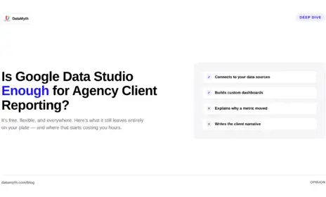
  • There’s no built-in written analysis, every insight has to be manually derived and typed out.
  • Non-Google data sources, like Meta Ads or LinkedIn Ads, often require third-party connectors that add setup complexity.

Where DataMyth Picks Up the Slack

DataMyth is built to skip the dashboard-building step entirely, offering ready templates plus automatically written performance insights, addressing the two biggest gaps agencies hit with Google Data Studio. For teams that started on Data Studio but found themselves rebuilding the same dashboard logic for every new client, this cuts a significant amount of repetitive setup work.

When Google Data Studio For Agencies Still Makes Sense

  • If you have in-house technical resources to build and maintain custom dashboards.
  • If your reporting needs are simple and mostly stay within the Google ecosystem.
  • If cost is the primary constraint and you can absorb the manual setup time.

Conclusion

Google Data Studio remains a capable, free tool, but its manual setup and lack of automated interpretation make it a heavier lift for agencies scaling across many clients. DataMyth targets exactly that gap, with ready templates and written insights built in from day one.

Is Google Data Studio free?

Yes, Google Data Studio (Looker Studio) is a free tool from Google, though building and maintaining dashboards still requires time and some technical know-how.

Does Google Data Studio explain why metrics changed?

No, it visualizes data but doesn’t generate written analysis; that interpretation has to be done manually by the user.

Can Google Data Studio connect to non-Google platforms?

Yes, but it typically requires third-party connectors for platforms like Meta Ads or LinkedIn Ads, adding setup complexity.

Why do agencies move from Google Data Studio to DataMyth?

Agencies typically switch when manual dashboard-building and writing performance commentary become too time-consuming across a growing client base.

DataMyth vs Whatagraph, Which Reporting Tool Fits Your Agency?

Introduction

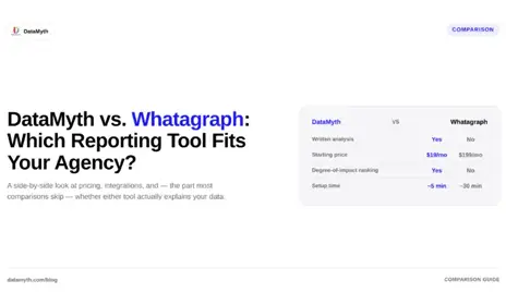
Whatagraph has built a reputation as a solid marketing dashboard software, but agencies comparing it against alternatives usually want to know one thing: does it explain performance, or just visualize it? This comparison breaks down where Whatagraph excels, where agencies hit friction, and how DataMyth approaches the same problem differently.

What Whatagraph Does Well

Whatagraph is known for polished, visually rich dashboards that pull data from a wide range of marketing analytics tools and ad platforms into one place. Agencies managing several clients often like its cross-channel dashboard layout and its focus on visual storytelling for stakeholder presentations.

Where Agencies Look for Something Different

  • Reports lean heavily on visuals, leaving written performance commentary to the account manager.
  • Pricing scales with connected data sources, which can add up quickly for agencies running multi-channel campaigns.
  • Some agencies want lighter, more focused tools rather than an all-in-one dashboard suite.

Where DataMyth Fits Instead

DataMyth takes a different approach by pairing every dashboard with an automatically written explanation of what changed and why, cutting down the manual analysis agencies typically add to a Whatagraph-style report. For agencies whose biggest bottleneck is writing the “why” behind the numbers rather than displaying the numbers themselves, this is often the deciding factor.

Making the Right Choice

  • Choose Whatagraph if your priority is highly customizable visual dashboards for client presentations.
  • Choose DataMyth if your team spends more time writing analysis than building charts.
  • Test both during a free trial period before switching client accounts permanently.

Conclusion

Whatagraph and DataMyth solve overlapping but distinct problems: one focuses on dashboard flexibility, the other on automated interpretation. Agencies drowning in commentary writing each reporting cycle tend to gravitate toward DataMyth’s insight-first model.

What’s the difference between a marketing dashboard and an automated report with insights?

A dashboard visualises data, charts, graphs, and numbers. An automated report with insights goes a step further, adding a written explanation of what changed and why, so the reader doesn’t have to interpret the chart themselves.

Can AI actually explain why a campaign’s performance changed?

Automated insight tools analyse the connected data, spend, audience, timing, and related metrics, to identify likely contributing factors and describe them in plain language. It’s a data-driven first explanation, most effective when paired with a quick human review for context the data alone doesn’t capture.

Do clients prefer reports with written insights over raw data?

Agencies that have made the switch generally report fewer clarifying calls and emails after sending reports, since clients no longer need the agency to explain what a chart means before they can act on it.

Is automated insight-writing accurate, or does it still need human review?

Automated insights are generated directly from real performance data, which makes them reliable as a starting point. Most agencies still do a brief human review before sending a report to a client, to add context, like an external event or a client-side change, that the data alone wouldn’t show.

DataMyth the AgencyAnalytics Alternative in 2026

Introduction

If you’ve been searching for an AgencyAnalytics alternative, you’re probably running into one of three problems: the pricing is scaling faster than your client list, you want reporting that explains performance rather than just charting it, or you simply want to compare your options before renewing a contract. This guide breaks down what to actually look for in an alternative, the main categories of tools available, and where DataMyth fits if your priority is automated, insight-driven reporting.

Why Agencies Look for an AgencyAnalytics Alternative

Agency Analytics is a well-established, all-in-one reporting platform, and for many agencies it works well. But agencies typically start evaluating alternatives for a few recurring reasons:

  • Per-client pricing that grows quickly as the client roster grows, which can strain margins for smaller agencies.
  • Reports that are strong on visualisation but still require a human to write the narrative, the “why did this change” explanation clients actually read.
  • A desire for a lighter, more focused tool rather than a broad platform bundling SEO auditing, rank tracking, and reporting together.
  • Wanting more flexibility in how white-label reports are branded, structured, and delivered.

What to Compare When Evaluating Alternatives

Not all reporting tools solve the same problem. Before comparing specific products, it helps to know which category you actually need:

  • All-in-one reporting platforms, combine data connections, dashboards, and scheduled client reports in one product (this is the category AgencyAnalytics and DataMyth both sit in).
  • Data pipeline tools, extract and load marketing data into a warehouse or spreadsheet, leaving you to build the report yourself. Useful if you already have a BI stack, overkill if you don’t.
  • Dashboard-only tools, strong on live visualisation, lighter on scheduled, narrative client reports.

Once you know which category fits, the real differentiators come down to: how the tool is priced as you scale, how much manual work is left after the report is generated, and how the report explains performance rather than just displaying it.

Where DataMyth Fits

DataMyth is built specifically for agencies that want to hand a client a report that reads like an analyst wrote it, without an analyst spending the hours. Rather than only visualising metrics, DataMyth automatically generates written performance insights alongside the data: the platform explains what changed and offers a plain-language reason, so account managers spend less time writing commentary before every client call.

For agencies specifically comparing an AgencyAnalytics alternative, the practical differences to weigh are: how reporting is priced as your client list grows, how much white-label control you get over report structure and branding, and how much of the report is written for you versus left as raw charts you have to interpret yourself.

How to Make the Switch Without Disrupting Clients

  • Run your new tool in parallel with your current one for one full reporting cycle before cancelling anything.
  • Rebuild your most-used report templates first, then expand to less frequent ones.
  • Let clients know reporting is being upgraded before the first report change arrives in their inbox, most clients respond well to “you’ll now get more detail,” not just a new logo.

Conclusion

There’s no single “best” AgencyAnalytics alternative, the right choice depends on whether you need an all-in-one platform, a data pipeline, or a tool built specifically around explaining performance rather than just displaying it. If writing (or rewriting) client commentary every reporting cycle is the part of the job eating your team’s time, that’s the gap DataMyth is built to close.

How to Automate Client Reporting: A Step-by-Step Guide for Agencies

Introduction

Most agencies don’t set out to spend hours every month copy-pasting numbers into a slide deck, it just happens gradually, one client at a time, until reporting quietly becomes one of the biggest time drains on the team. How to automate client reporting isn’t complicated, but it does need to be set up properly the first time so it keeps working without babysitting. Here’s exactly how to do it.

Step 1: Audit What You’re Currently Reporting On

Before automating anything, list out every metric currently included across your client reports and where that data lives, Google Ads, GA4, Meta Ads, LinkedIn Ads, Google Search Console, and so on. Most agencies discover during this step that they’re manually re-pulling the same five or six metrics for every client, which is exactly the repetitive work automation is built to remove.

Step 2: Connect Your Data Sources Once

A proper reporting tool connects directly to each ad and analytics platform so data flows in automatically instead of being exported and re-uploaded every cycle. This is typically a one-time setup per client: authorise the connection, and the tool keeps pulling fresh data on schedule from then on.

Step 3: Automate Client Reporting Template Once, Reuse It Everywhere

Instead of designing a new report for each client, use a fixed template with your standard metrics and branding, then apply it across your client base. Most reporting platforms let you clone and lightly customise a template per client, which is far faster than starting from a blank report each time.

Step 4: Automate Client Reporting Narrative, Not Just the Numbers

This is the step most agencies skip, and it’s the one that saves the most time. Charts alone still require someone to look at the data and write a paragraph explaining what happened and why. Tools like DataMyth generate that explanation automatically, turning a raw data table into a report a client can actually read and understand without a call to interpret it.

Step 5: Schedule Automatic Delivery

Set reports to generate and send on a fixed schedule, weekly, bi-weekly, or monthly, so delivery no longer depends on someone remembering to hit send. Most platforms support PDF export and direct email delivery, and some offer a live client portal as an alternative to a static file.

Step 6: Review, Don’t Rebuild

Once automation is running, your team’s job shifts from building reports to reviewing them, a five-minute skim before delivery rather than hours of manual assembly. This is where most of the time savings agencies report actually come from.

Conclusion

How to automate client reporting isn’t about removing your team from the process, it’s about removing the repetitive, low-value parts so the time your team does spend is on judgment calls, not data entry. Agencies that automate both the numbers and the narrative typically see the biggest time savings, since writing commentary is usually the slowest part of the old process.

Frequently Asked Questions (Faqs)

How long does it take to automate client reporting?

Initial setup, connecting data sources and building your first template, typically takes anywhere from a few minutes to a few hours per client, depending on how many platforms you’re pulling data from. After that, reports generate automatically with no extra setup time.

What data sources can be automated into a client report?

Most modern reporting tools connect to the major advertising and analytics platforms agencies use daily, including Google Ads, Google Analytics 4, Meta Ads, LinkedIn Ads, and Google Search Console.

Can automated reports still be customised for each client?

Yes. Automation typically applies to data pulling and report generation, not branding, most platforms let you white-label each report with your agency’s or client’s own logo, colours, and layout.

How much time do agencies actually save by automating reporting?

Industry estimates suggest marketers can spend around 7.5 hours a week building reports manually. Automating data collection and, ideally, the written analysis as well removes the majority of that time.

Do automated reports explain why performance changed, or just show the data?

It depends on the tool. Basic automation only pulls and charts data, leaving interpretation to a person. More advanced platforms, including DataMyth, automatically generate the written explanation behind each change, closing the gap between data and insight.

Beyond Dashboards: Why Marketing Reports Need Automated Performance Insights

Open almost any marketing dashboard or marketing reports and you’ll see the same thing: a wall of charts showing clicks, impressions, conversions, and spend, trending up or down. What you won’t see, in most tools, is an explanation of why any of it happened. That gap, between showing data and explaining it, is exactly what automated performance insights are built to close, and it’s changing what agencies can reasonably promise their clients.

The Problem With Dashboard-Only Marketing Reports

A dashboard is a mirror: it reflects what happened, accurately and often beautifully, but it doesn’t tell you anything you didn’t already know how to look for. A client looking at a dip in conversions still has to ask, “why did this happen?”, and someone on the agency side still has to dig through the data to answer that question every single reporting cycle. Dashboards solve visualisation. They don’t solve interpretation.

What “Automated Insights” Actually Means

Automated performance insights take the same underlying data a dashboard shows and add a written, plain-language explanation of what changed and, where the data supports it, why. Instead of a chart showing conversions dropped 18% in the last two weeks, an insight-driven report states that conversions dropped 18%, largely concentrated in one campaign, coinciding with a drop in ad spend on that campaign. That’s the difference between a chart and an answer.

Why This Matters More for Agencies Than for In-House Teams

An in-house marketer lives inside their own data every day and can usually spot a trend without much explanation. An agency account manager might be reviewing a dozen or more clients’ accounts in the same week, across different industries and different baselines. Written insights do the first pass of interpretation automatically, so the account manager’s time goes toward judgment and client conversation, not toward re-deriving the same explanation from scratch for every account.

How This Changes the Client Conversation

  • Clients read a plain-language explanation instead of asking the agency to interpret a chart on a call.
  • Account managers spend review time checking the insight against their own knowledge of the account, rather than writing the insight from scratch.
  • Reports become genuinely self-serve, a client can understand what happened without scheduling a meeting to have it explained.

Is Automated Insight-Writing Accurate Enough to Trust?

Automated insights are generated directly from the connected data, which makes them consistent and fast, but like any automated analysis, they work best as a strong first draft rather than a final, unreviewed verdict. The most effective workflow pairs automated insights with a quick human review before a report goes to a client, catching context the data alone can’t capture (a paused campaign, a seasonal event, a client-side change) while still eliminating the hours previously spent writing commentary from a blank page.

Conclusion

Dashboards were the last generation of marketing reporting. The next generation explains itself. As more agencies adopt automated performance insights, a report that only shows charts will start to look incomplete by comparison, clients will expect to be told what happened, not asked to figure it out themselves. Tools like DataMyth are built around that shift, generating the written explanation alongside the data rather than leaving it as homework for the account manager.

Frequently Asked Questions (FAQs)

What’s the difference between a marketing dashboard and an automated report with insights?

A dashboard visualises data, charts, graphs, and numbers. An automated report with insights goes a step further, adding a written explanation of what changed and why, so the reader doesn’t have to interpret the chart themselves.

Can AI actually explain why a campaign’s performance changed?

Automated insight tools analyse the connected data, spend, audience, timing, and related metrics, to identify likely contributing factors and describe them in plain language. It’s a data-driven first explanation, most effective when paired with a quick human review for context the data alone doesn’t capture.

Do clients prefer reports with written insights over raw data?

Agencies that have made the switch generally report fewer clarifying calls and emails after sending reports, since clients no longer need the agency to explain what a chart means before they can act on it.

Is automated insight-writing accurate, or does it still need human review?

Automated insights are generated directly from real performance data, which makes them reliable as a starting point. Most agencies still do a brief human review before sending a report to a client, to add context, like an external event or a client-side change, that the data alone wouldn’t show.