
How to present marketing data to clients is a skill that most agencies develop by trial and error over years of client calls where the client asked “but what does this mean?” or “what should we do about this?” after receiving a report. The pattern in those questions is always the same: the data was present, but the interpretation and the action were missing.
Knowing how to present marketing data clearly is what separates an agency that delivers reports from an agency that delivers decisions. This guide covers the specific practices, narrative structure, chart selection, language choices, and data hierarchy, that make marketing data immediately useful to the clients who receive it.
Why Is Presenting Marketing Data Difficult?
Most marketers are more comfortable with data than their clients are. The gap creates a communication challenge: the metrics that feel intuitive to an experienced practitioner (ROAS, engagement rate, impression share) feel opaque to a business owner or CFO evaluating whether their marketing investment is working.
Presenting marketing data effectively requires translating from the language of the platform to the language of the client’s business goal. A retail CFO does not care what impression share means, they care whether the campaign is producing profitable sales. A B2B founder does not care what average session duration means, they care whether the content is producing qualified leads.
The translation is the agency’s job. The client should not have to do it themselves.
What Narrative Structure Works for Marketing Data Presentations?
How to present marketing data effectively follows a consistent narrative structure, regardless of whether the presentation is a written report, a slide deck, or a call:
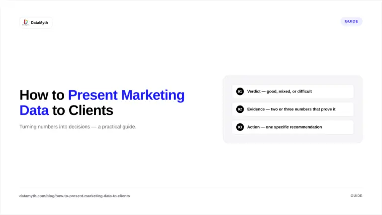
Structure 1: Verdict — Evidence — Action
- Verdict: What was the result of the period? Good, mixed, or difficult — and why in one sentence.
- Evidence: Which specific metrics support the verdict? Show the two or three numbers that prove the statement, with period comparison.
- Action: What should change as a result? One specific, testable recommendation.
This structure works because the client learns the conclusion before the data, which means they process the data as confirmation of something they already understand rather than as a puzzle they are assembling.
Structure 2: Problem – Cause – Solution
Use this structure for report sections where performance underperformed:
- Problem: Cost per lead increased 32% month-over-month.
- Cause: Average keyword position dropped from 2.1 to 3.6 due to increased competitor bidding on our top three keywords.
- Solution: We are raising bids on the three affected keywords by 15% and adding two alternative keywords that show strong volume at lower competition.
This structure demonstrates analytical depth (the cause, not just the symptom) and proactive management (the solution is already in progress, not pending).
How Do You Choose the Right Chart for Marketing Data?
Chart selection is the most commonly made error in how to present marketing data to clients. The wrong chart type makes data harder to understand even when the data itself is correct.
| Data to show | Right chart | Wrong chart |
|---|---|---|
| Performance over time (trend) | Line chart | Bar chart, pie chart |
| Comparison across categories | Horizontal bar chart | Pie chart, area chart |
| Single key metric vs target | KPI tile / gauge | Line chart with cluttered context |
| Channel breakdown by volume | Horizontal bar chart | Pie chart |
| Funnel stages (conversion rates) | Funnel chart / waterfall | Pie chart, line chart |
| Geographic performance | Map or ranked table | Pie chart |
The pie chart problem: Pie charts require the viewer to estimate the angular difference between segments to compare them, a task humans do very poorly. A horizontal bar chart showing the same category breakdown allows immediate visual comparison of lengths. For almost all marketing data use cases, a bar chart or table is more readable than a pie chart.
The cluttered line chart problem: Line charts with more than five data series become unreadable. If you need to show seven channels’ performance trends simultaneously, use a table with conditional formatting (green for positive trend, red for negative) rather than a seven-line chart.
How Do You Translate Technical Marketing Metrics Into Business Language?
The core skill in how to present marketing data is translation. Specific translation examples:
| Technical metric | Client-facing translation |
|---|---|
| CTR: 4.2% | “4.2% of people who saw the ad clicked it, above average for this sector” |
| Impressions: 450,000 | “Your ads appeared 450,000 times to potential customers this month” |
| Engaged sessions: 12,400 | “12,400 visitors spent meaningful time on the site, reading content, viewing products, or completing a goal” |
| ROAS: 4.2 | “For every $1 spent on Google Ads, $4.20 in revenue was attributed to those campaigns” |
| Impression share: 68% | “Your ads appeared in 68% of relevant searches; 32% were missed, mainly due to budget limits” |
| Quality Score: 7/10 | “Google rates our ad and landing page quality at 7 out of 10, which means we are paying less per click than lower-scored competitors” |
The translation pattern: explain what the metric measures in one sentence, provide the client’s number, give the directional verdict (above/below average, improving/declining), and connect it to a business outcome where possible.
How Does DataMyth Help Present Marketing Data?
How to present marketing data clearly is a core function of DataMyth’s reporting platform. DataMyth generates written analysis that translates each metric movement into a business narrative, explaining what changed, attributing a cause, and contextualising against prior period performance. The account manager reviews and refines this analysis rather than writing it from scratch.
The report output formats (PDF, shareable link) are structured to follow the verdict-evidence-action narrative structure, with headline KPI tiles at the appropriate visual weight and channel sections following the consistent hierarchy that makes data easy to navigate. See DataMyth’s reporting output.
What Should You Avoid When Presenting Marketing Data?
Avoid jargon without explanation. The first time any technical term appears in a client-facing report, include a one-sentence definition in parentheses. Thereafter it can stand alone.
Avoid presenting every available metric. Twelve metrics per channel section is too many. Prioritise the five or six that directly answer whether the campaign is working. Additional metrics move to the appendix.
Avoid positive spin that hides problems. A report that leads with high impressions when conversion rate dropped significantly is presenting the right data in the wrong order. Lead with the verdict, not the most flattering metric.
Avoid no recommendation. Data presented without a recommended action is a description, not strategic reporting. Every report section should end with “therefore we recommend…” or the equivalent.
How Do You Present Marketing Data in a Live Client Call?
How to present marketing data in a live call differs from a written report because the client can ask questions in real time, and the order of information matters more. Practical guidance:
Start with the verdict before sharing the screen. Before opening the report, state the verdict verbally: “May was a strong month, conversions were up 24% and cost per lead dropped significantly. I want to walk you through what drove this and what we are doing in June.” The client now processes the data as confirmation, not as a puzzle they are assembling.
Share the executive summary first. Walk through each line of the executive summary rather than jumping to the detailed channel sections. The summary provides the structure; the detailed sections answer follow-up questions.
Let the client see the data before explaining it. When transitioning to a chart or table, give the client 10-15 seconds to review the visual before narrating it. Clients who have processed the data themselves are more engaged with the explanation than clients who hear the narrative while still scanning the numbers.
End every section with the action. After narrating each channel’s performance, close with: “Based on this, in June we are going to [specific action].” This moves the conversation from review to decision-making, which is where the agency earns its strategic value.