
Introduction
Whatagraph has built a reputation as a solid marketing dashboard software, but agencies comparing it against alternatives usually want to know one thing: does it explain performance, or just visualize it? This comparison breaks down where Whatagraph excels, where agencies hit friction, and how DataMyth approaches the same problem differently.
What Whatagraph Does Well
Whatagraph is known for polished, visually rich dashboards that pull data from a wide range of marketing analytics tools and ad platforms into one place. Agencies managing several clients often like its cross-channel dashboard layout and its focus on visual storytelling for stakeholder presentations.
Where Agencies Look for Something Different
- Reports lean heavily on visuals, leaving written performance commentary to the account manager.
- Pricing scales with connected data sources, which can add up quickly for agencies running multi-channel campaigns.
- Some agencies want lighter, more focused tools rather than an all-in-one dashboard suite.
Where DataMyth Fits Instead
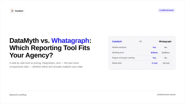
DataMyth takes a different approach by pairing every dashboard with an automatically written explanation of what changed and why, cutting down the manual analysis agencies typically add to a Whatagraph-style report. For agencies whose biggest bottleneck is writing the “why” behind the numbers rather than displaying the numbers themselves, this is often the deciding factor.
Making the Right Choice
- Choose Whatagraph if your priority is highly customizable visual dashboards for client presentations.
- Choose DataMyth if your team spends more time writing analysis than building charts.
- Test both during a free trial period before switching client accounts permanently.
Conclusion
Whatagraph and DataMyth solve overlapping but distinct problems: one focuses on dashboard flexibility, the other on automated interpretation. Agencies drowning in commentary writing each reporting cycle tend to gravitate toward DataMyth’s insight-first model.
What’s the difference between a marketing dashboard and an automated report with insights?
A dashboard visualises data, charts, graphs, and numbers. An automated report with insights goes a step further, adding a written explanation of what changed and why, so the reader doesn’t have to interpret the chart themselves.
Can AI actually explain why a campaign’s performance changed?
Automated insight tools analyse the connected data, spend, audience, timing, and related metrics, to identify likely contributing factors and describe them in plain language. It’s a data-driven first explanation, most effective when paired with a quick human review for context the data alone doesn’t capture.
Do clients prefer reports with written insights over raw data?
Agencies that have made the switch generally report fewer clarifying calls and emails after sending reports, since clients no longer need the agency to explain what a chart means before they can act on it.
Is automated insight-writing accurate, or does it still need human review?
Automated insights are generated directly from real performance data, which makes them reliable as a starting point. Most agencies still do a brief human review before sending a report to a client, to add context, like an external event or a client-side change, that the data alone wouldn’t show.