
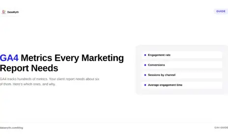
Google Analytics 4 gives you more data than any client will ever read, which is exactly the problem. Dump every available number into a report and you bury the story. The skill is not access to data; it is knowing which GA4 metrics actually explain performance and which are just noise. Here are the metrics that belong in every marketing report, organized around the questions a client genuinely wants answered.
Before listing metrics, it helps to frame why they matter. A good report answers three questions: How many people came? What did they do? Did they convert? These map to the classic acquisition, behavior, and conversion structure that GA4 is built around. Every metric you include should serve one of those three questions, and anything that does not is a candidate for cutting.
Organizing your GA4 metrics this way keeps reports focused. Instead of a wall of numbers, the client sees a clear narrative: here is your traffic, here is what it did, here is what it earned you.
The acquisition section answers where your traffic came from and whether the mix is healthy. The core metrics here:
Among GA4 KPIs, the channel breakdown is the one that usually sparks the most useful conversation, because it ties traffic directly to the marketing activities the client is paying for.
Once people arrive, behavior metrics reveal whether the site actually engages them. GA4 reframed this area around engagement rather than the old bounce rate, and the modern metrics are more useful for it:
These website performance metrics answer the middle question, whether the traffic you acquired found what it needed, which is where many reports go silent and shouldn’t.
The conversion section is where the client sees value, and it is the section that justifies the marketing spend. The essential metrics:
This is the part of Google Analytics 4 reporting clients care about most, because it connects the marketing work to outcomes they can feel.
Just as important as what to include is what to cut. Reports drown in metrics that feel informative but rarely change a decision. Raw pageview totals without context, obscure technical dimensions, and any metric no one can act on all add length without adding insight. If a number would not change what the client does next, it probably does not belong in the report.
Restraint is a feature. A tight report that answers the three core questions clearly beats an exhaustive one that answers none of them.
Here is the part most reports miss entirely. A list of GA4 metrics, however well chosen, is still just numbers until someone explains what changed and why. A client seeing that conversions dropped 12% does not want to hunt for the cause; they want to be told the drop came from a fall in paid traffic after a budget change, for example.
This is where automated analysis earns its place. DataMyth takes your selected GA4 metrics, structures them around the acquisition, behavior, and conversion model, and generates the written explanation of what moved and why, identifying the change and its likely cause based on the degree of impact. The report stops being a data dump and becomes something the client can read and act on in minutes.
The best client reporting starts from what the reader needs to know, not from what the tool can display. Choose the GA4 metrics that answer the three questions, cut the ones that do not, and pair the numbers with a plain-language explanation of what they mean. Do that, and your reports go from something clients skim to something they rely on, which is the whole point of reporting in the first place.